描述
宇拓設計-詹松樹
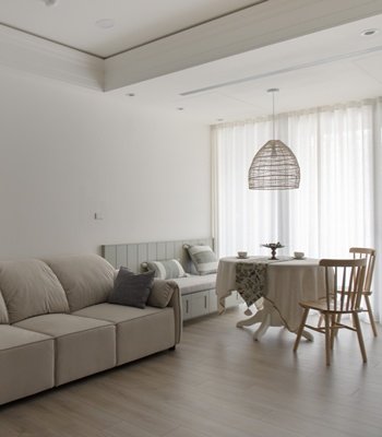
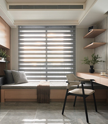
此案因屋主喜歡室內陽光充沛,以及空氣充分對流,因此自規劃初期,就希望減少厚實的隔牆以及櫃體,利用縱向貫穿的佈局手法,讓陽光灑進室內,深入角落。整體佈局簡樸,以功能性為主,去除繁瑣以及複雜,讓空間產生安穩舒適的感受。
與客戶事前充分的溝通,傾聽每位客戶的需求,提供希望的生活品味,打造出美觀、舒適、功能皆具備的空間,是之前必須做到的事。此案需要保留採光並盡可能利用自然光源,創造開放的空間,以及深藍與木質的色調搭配。房屋在原先就擁有良好的採光優勢,採開放式空間裝潢之後更顯得通透明亮。平面格局方正且整潔,易營造簡約卻不單調的空間。依照屋主喜好的色調,以深藍色與淡色系搭配,整體為中性色調。櫃體用木質調進行設計,運用燈光增加氛圍,讓室內溫柔和煦。
玄關處利用木質調作為櫃體的基體設計,並運用燈光來營造視覺,雖簡約素雅,但在燈光投射下,多了層次感。淺色木皮與適當的留白、跳色,貫穿整體空間。暖色系的畫作與色彩跳躍幅度大的藝術海報,和深藍色做出映襯,讓溫暖溫馨與現代感互相呼應以及平衡。玄關與客廳天花板,利用燈條做為視覺引導,規劃出縱橫主軸。主臥櫃體以整潔及溫暖為主題,保持舒適與優雅,天花板以局部弧形做修飾,減輕視覺上厚重的感受。
In this case, the homeowner likes to have sufficient indoor sunlight and adequate air convection; since the initial planning stage, he hopes to reduce the thick partition walls and cabinets, and use the vertical penetration layout method to let the sunlight enter the room and penetrate into the corners. The overall layout is simple, focusing on functionality, removing complexity, and giving the space a sense of stability and comfort. Communicate with customers beforehand, listen to each customer’s needs, provide the desired taste of lifestyle, and create a beautiful, comfortable and functional space that must be done before. In this case, daylighting needs to be preserved and natural light sources are used as much as possible to create an open space, as well as dark blue and wood tones.
The house originally had a good daylighting advantage, and it became more transparent and brighter after it was decorated with an open space. The plane layout is square and tidy, and it is easy to create a simple but not monotonous design. According to the owner’s preference, dark blue and light colors are used to match each other, and the overall color is neutral. The cabinet is designed with wood tones, and lighting is used to increase the atmosphere, making the interior gentle and warm.
The porch uses wood tones as the base design of the cabinet, and uses light to create the vision. Although it is simple and elegant, it has a sense of layering under the projection of the light. The light-colored veneer and appropriate white space and color skipping run through the whole space. Warm-color paintings and art posters with large color contracts against the dark blue, making the warmth and modernity echo and balanced with each other. The porch and the ceiling of the living room use the light bar as a visual guide to plan the vertical and horizontal axis. The main bedroom cabinet is themed with cleanliness and warmth, maintaining comfort and elegance, and the ceiling is decorated with a partial arc to reduce the visually heavy feeling.


國際獎項報名代辦洽詢專線:02-2799-7723


![設計獎項新訊|[小編精選]2026年6月份國際設計獎項資訊 DECO TV / 設計盒子](https://yusi-group.com/wp-content/uploads/2026/04/WGA全球2026_1000_2_350.jpg)
