描述
宇拓設計-詹松樹
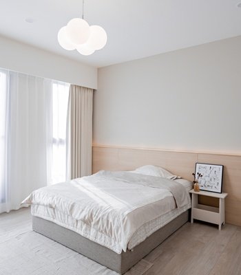
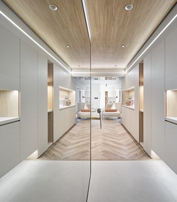
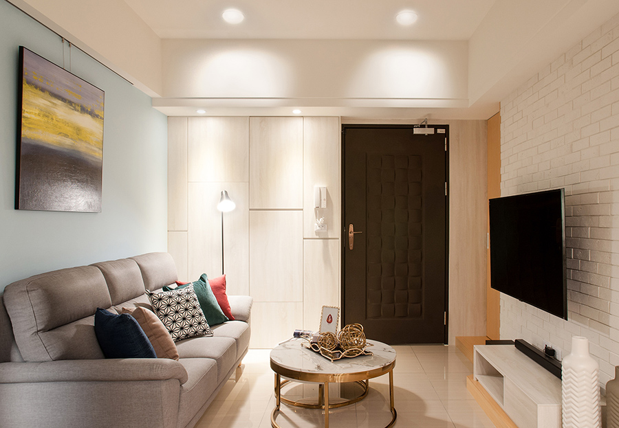
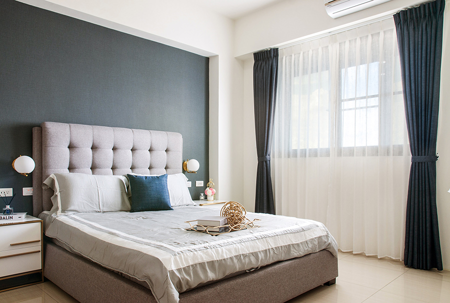
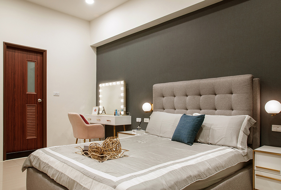
本案設計將小坪數住宅打造為溫馨小屋。利用既有的空間去打造無限的可能。整體風格追求極簡與俐落的個性。透過空間串連與動線設計,讓居家生活自由流暢、互動交流大幅提升,同時避免小空間帶來的壓迫感。為保持明亮乾淨的樣貌,多採用清爽的北歐簡約風格與用色。利用良好的採光設計,讓視野擴大,增添舒適宜居的感受。
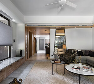
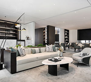
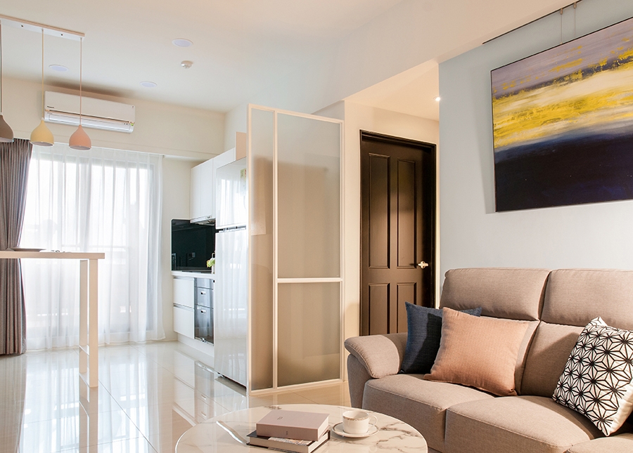
一開門入室,即可一眼望盡簡約俐落的客廳與餐廳。比起使用傳統隔間,設計師利用鐵件隔屏設計,創造開放式空間。電視牆兩側的木門隱藏於牆內,讓空間沒有斷層感、視覺延長,順暢流通到底。客廳與餐廳大量使用淡色的木質材料、白色石材的桌子、簡單方正的木櫃。在裝飾上,也用了鐵道磚、吊燈、文化石等材料,讓簡單更有趣味與品味。選色上無論是裝飾、家具跟牆面都大致保持淡色系、粉彩色系,配上暖光燈泡與落地窗透進來的陽光,讓整體視覺效果清爽可愛、舒服得宜。
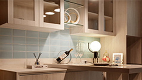
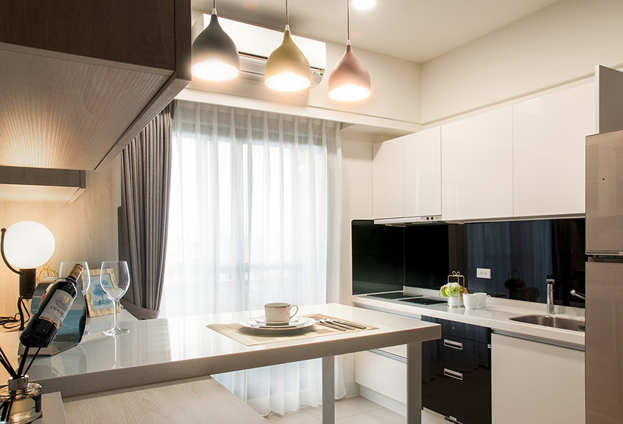
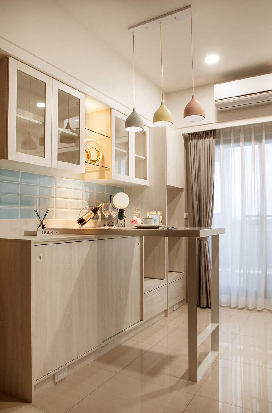
廚房餐廳結合,各佔一面,流理臺白黑色的設計乾淨明瞭,餐櫃檯除了上下左右側都設置大量木質收納櫃外,也利用其設置延伸吧台,平時用餐外也可當作書桌使用、邀請朋友家人用餐時更增添實用性。此設計展現空間、家具的多功能性。自由環狀的空間動線,讓互動更加流暢密切。
溫馨小宅的簡潔舒適,全都要歸功於設計師處處的小巧思,化狹小為溫馨,是本設計最大的亮點。讓設計帶來美感卻不雜亂。即便是小坪數家庭也能輕鬆做到,空間設計帶來的絕妙幸福,讓家人與賓客一入門即感受到熱絡舒適。
The design of this project transforms little space residence into a cozy cottage. Use the existing space to create unlimited possibilities. The overall style pursues minimalism and neat personality. Through space connection and movement design, home life is at a free smooth flow, interactive communication is greatly improved within the space, and at the same time, it avoids the sense of oppression brought by small spaces. In order to maintain a bright and clean appearance, refreshing Nordic minimalist styles and colors are often used. Use good lighting design to expand the field of vision and add a feeling of comfort and livability.
As soon as opening the door and entering the room, the simple and neat living room and dining room can be seen at a glance. Compared with the traditional partition, the designer uses the iron partition design to create an open space. The wooden doors on both sides of the TV wall are hidden in the wall, so that the space has no sense of discontinuity, visual extension, and smooth circulation to the end. Light wood materials, white stone tables, and simple square wooden cabinets are widely used in the living room and dining room. In the decoration, railway bricks, chandeliers, cultural stones and other materials are also used to make the simplicity more interesting and tasteful. Regarding the color selection, the decoration, furniture and walls are generally kept in light and pastel colors. The warm light bulbs and the sunlight from the floor-to-ceiling windows make the overall visual effect refreshing, lovely and comfortable.
The kitchen and dining room are combined, each occupying one side. The white and black design of the table is clean and clear. In addition to the large number of wooden storage cabinets on the upper and lower left and right sides of the dining counter, it is also used to extend the bar. It can also be used as a desk and inviting outside of meals It is more practical when dining with friends and family. This design shows the versatility of space and furniture. The free circular space movement makes the interaction smoother and closer.
The simplicity and comfort of the cozy space is all due to the designer’s ingenuity everywhere, which is the biggest highlight of this design. Let the design bring beauty without clutter. Even living in a little space family can do it easily. The wonderful happiness brought by the space design makes the family and guests feel warm and comfortable as soon as they get started.
國際獎項報名代辦洽詢專線:02-2799-7723

