描述
羽筑設計- 田志傑
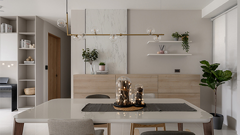
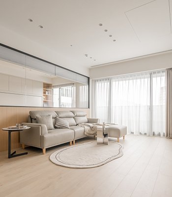
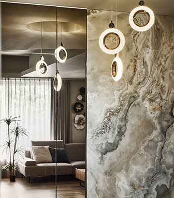
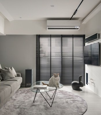
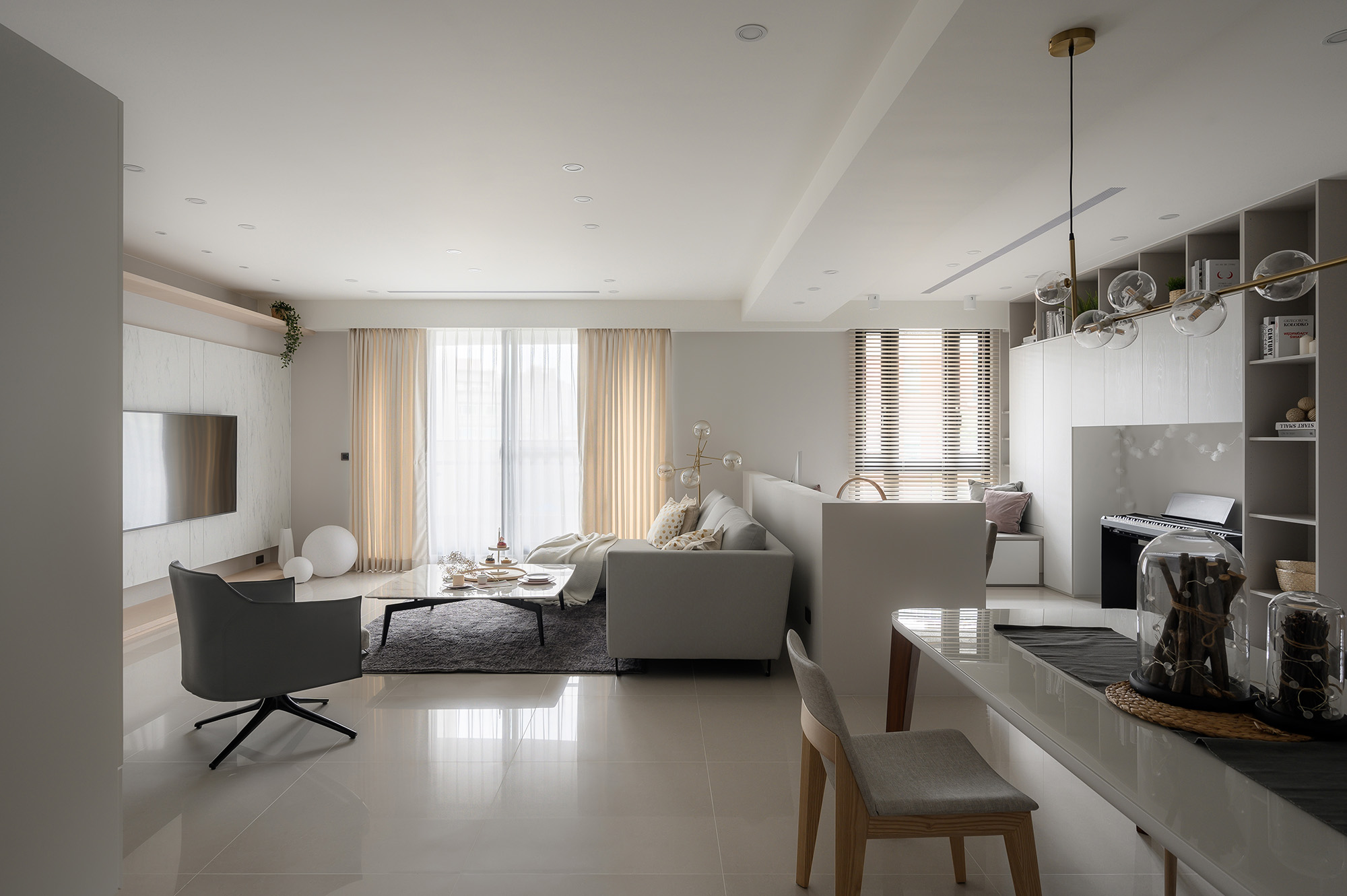
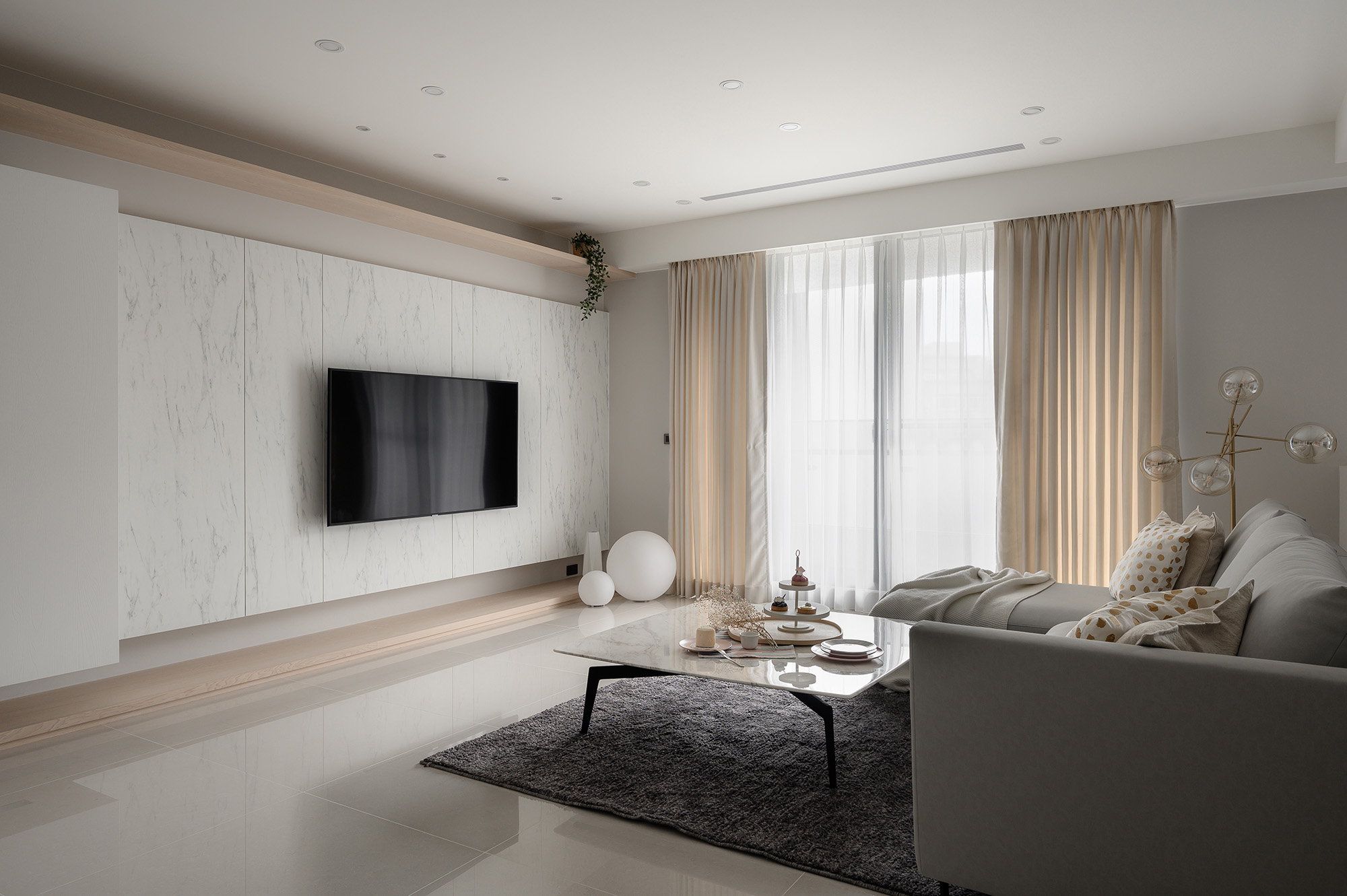
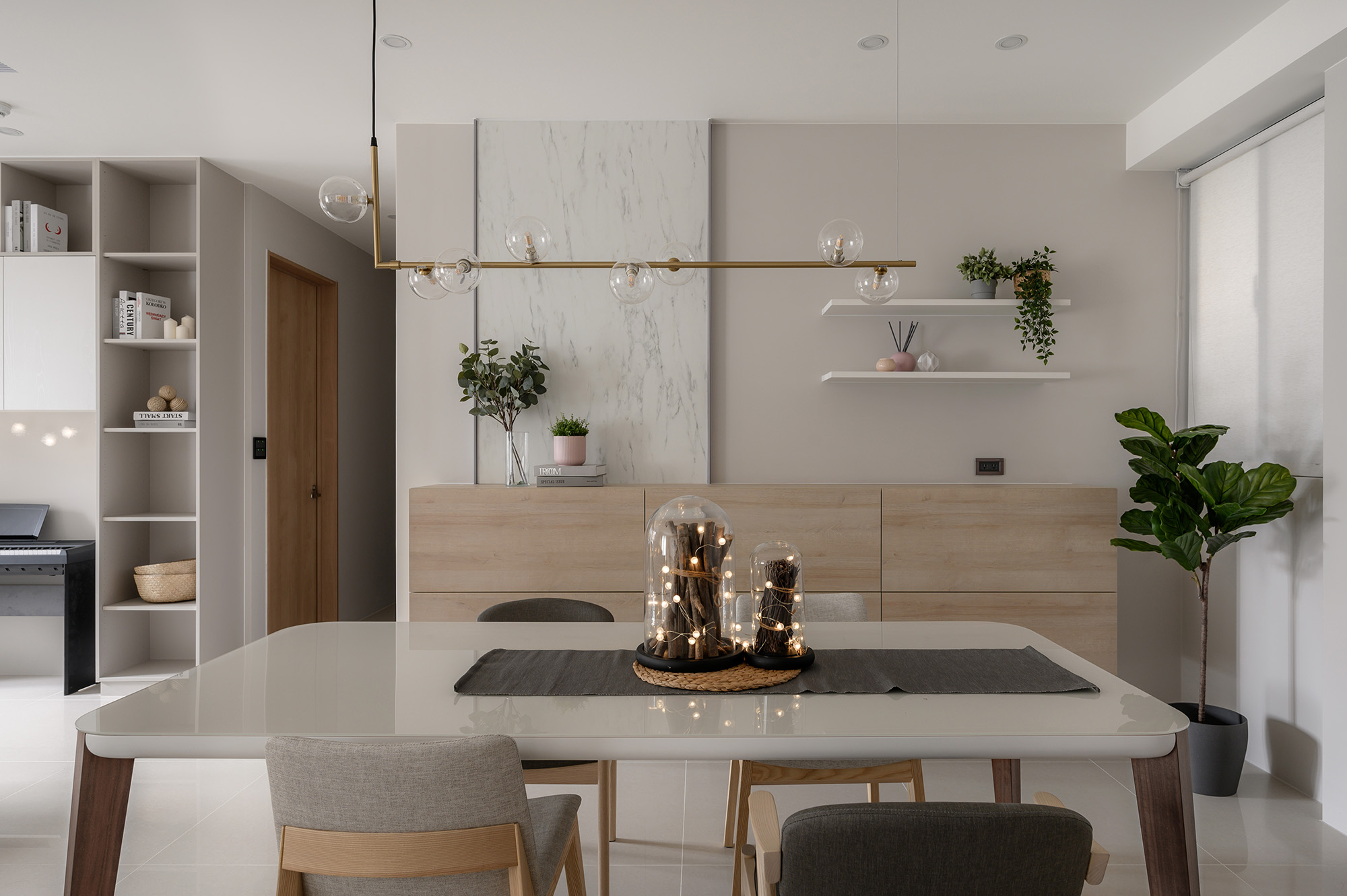
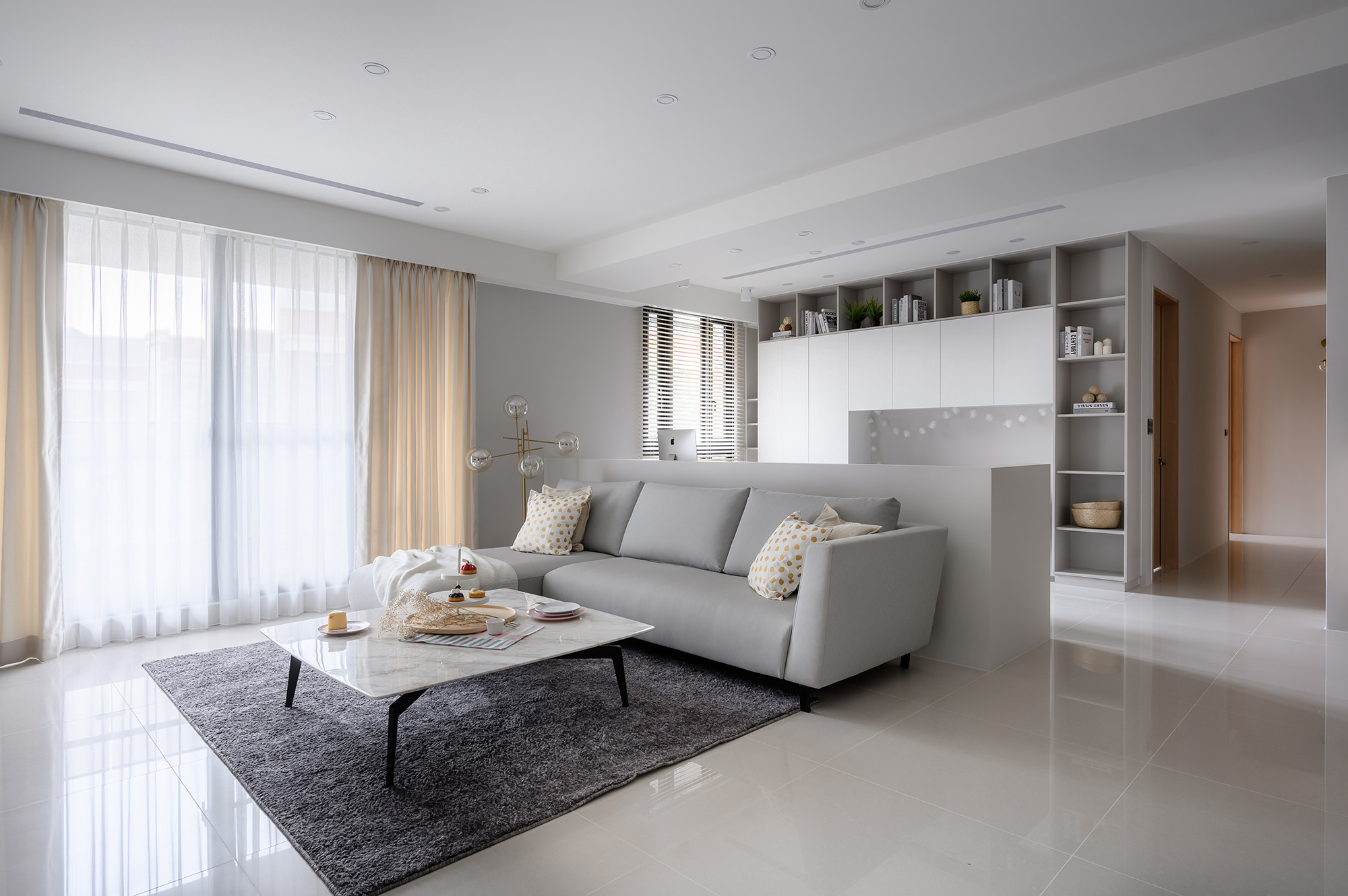
生活是一闕交響樂,生活的每一個時刻,都是幾重唱的結合。 此設計案藉以簡潔、明亮的休閒風格呈現,為營造輕鬆舒適的空間感受,鋪展淺白色系的簡約質感營造輕盈剔透的視覺效果,巧心翻轉木質性格,引導出柔和調性,為量體挹注雅緻溫婉的空間表情,輔以燈飾點綴遂而穩定場域重心,點點晶亮的空間佈置,凸顯公領域於空間內的重要地位,提供家人心靈交流,相互撫慰情感的功能。踏入其中,第一眼得以望見後方的造型牆與餐桌吊燈,前後呈現一種端景,如同一幅富有層次感的畫作,此外,更利用柔和色彩減輕一整天的視覺疲勞,僅用些微燈具的金屬,卻足以勾勒出各個精巧空間的亮點。
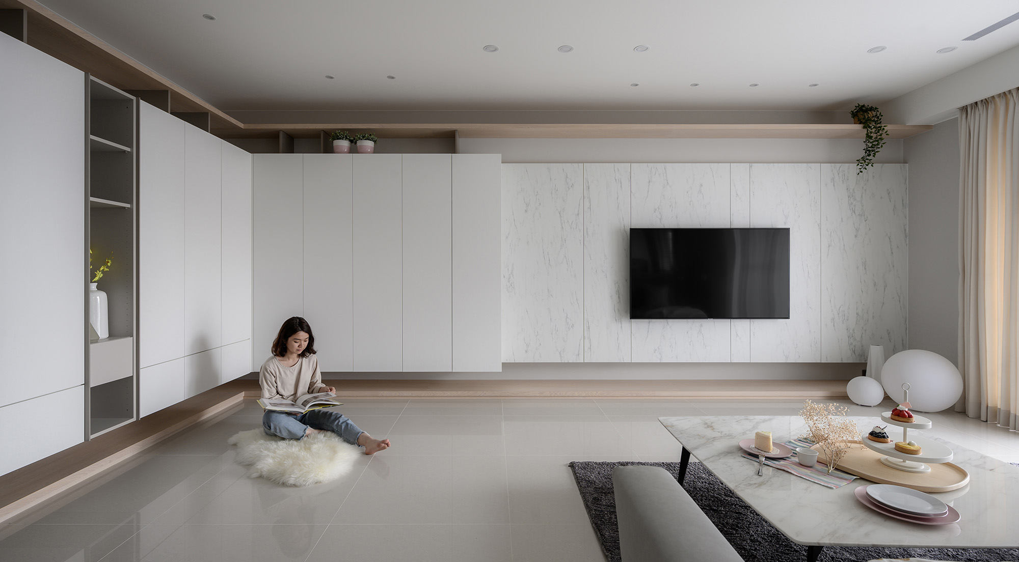
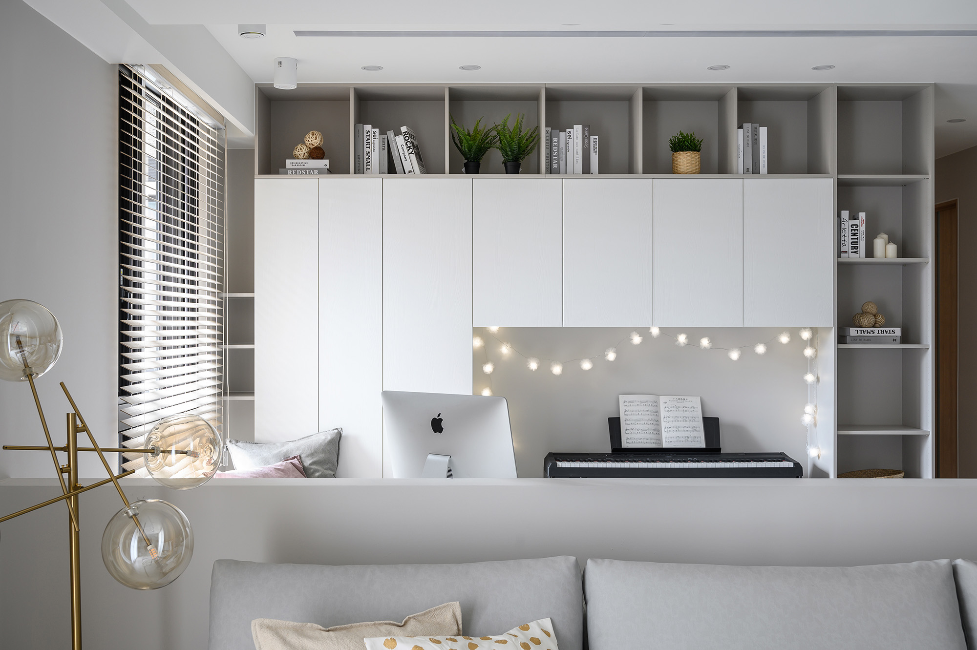
設計之初,為保持四面空間的協調性、簡潔的視覺感與簡約感受的比重,更尚需解決空間收納的常見問題,且由於櫃體深度較深,屋主希望櫃體輕量化,免除笨重的視覺感。對此,首先利用水平線及造型延伸,讓空間比例一致,捨棄過多複雜的設計手法,使用乾淨俐落的線條切割,看似簡單卻不失單調的感覺,出自設計師精心的巧思,再者,讓櫃體猶似豆腐塊做分割,藉此讓量體變小,分散使用空間之餘同樣能滿足屋主的收納需求。陽光穿梭於室內,空間承載親人間相濡以沫的痕跡與溫暖,只願感受歲月靜好的點滴時光,足矣。
Life is a symphony, and every moment of life comprises different vocals. This design project presenting the simple and bright relaxed style spawns the laid-back ambience. The simple and graceful textures of light white colors show the airy and clear visual effect. The design ingenuity brings out the soft characteristics of woods, thus strengthening the elegant and graceful features of space. The delicate lightings, acting as a supplementary role, secure a convergent state of space and accentuate the importance of the public area where binds and sooths the family. The stylish wall and the ceiling light in the dining room, both of which located in the rear public area, come into view for the moment coming in the residence. The front and rear public area appear as a vista that is as delicate as an art painting. The use of soft colors, additionally, help reduce eye fatigue after a busy day. The lighting fixtures subtly adorned with metals ingeniously accentuate the captivating features in different spaces.
When the design project began, there were several goals to accomplish and problems to solve, including to preserve the harmonious features of each space, to manifest the clear visual effect and feeling, and to overcome the problems of storage functions. Considering the previous big storage cabinets, the houseowner wants to have the new cabinets which are more lightweight and clear-cut. To manage these situations, the designer uses the flat lines and consistent styles that present the persistent scale among spaces. Without using the redundantly sophisticated design skills, the designer uses the neat lines to allocate spaces showing the simple charms without exposing the dull feeling, which indicate the designer’s brilliant design ideas. The new tofu-like cabinets become smaller, and they can satisfy the houseowner’s different needs for storage.
As the sunlight permeating in the home, the indoor space conveys the history and the warmth of the loved ones, who are simply fulfilled with the wonderful moments of time.
國際獎項報名代辦洽詢專線:02-2799-7723

