描述
形拾室研- 曹登勝
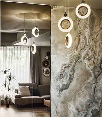
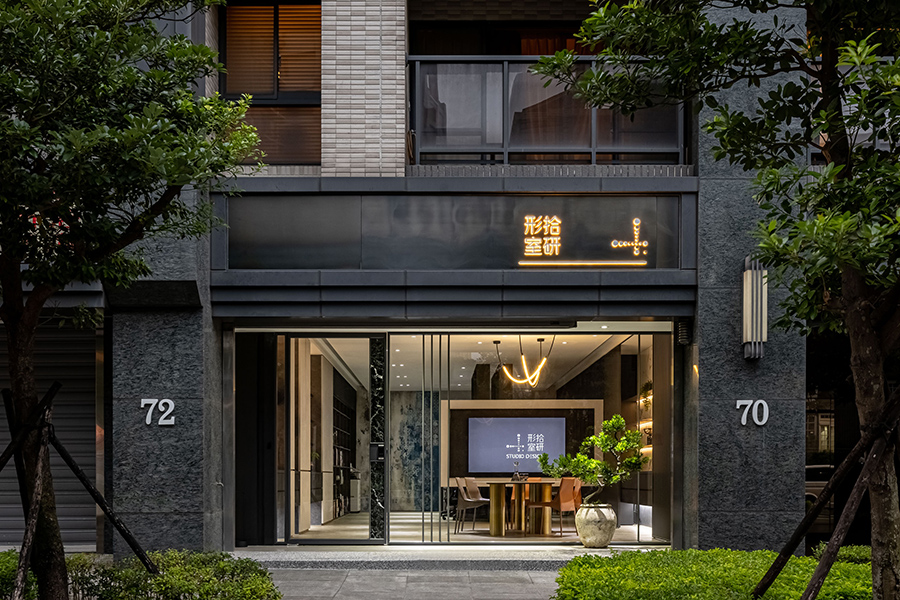
「空間是生活的容器」,設計師細心地形塑空間、讓使用者拾起生活的各種片刻。以舒適、通透、明亮的辦公室裝潢,帶給客人印象深刻的企業形象,提供值得信任的專業態度。以木、進口薄板、鐵件為材料基礎,幾何、線條為元素堆疊,簍空漂浮、燈光營造為氛圍形式。讓陽光穿透、空氣流通,在溫雅的環境裡,處處有線條交疊、暖色光芒承起收藏,讓細節替品牌的專業說話。
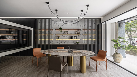
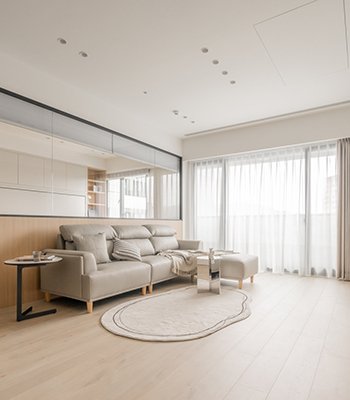
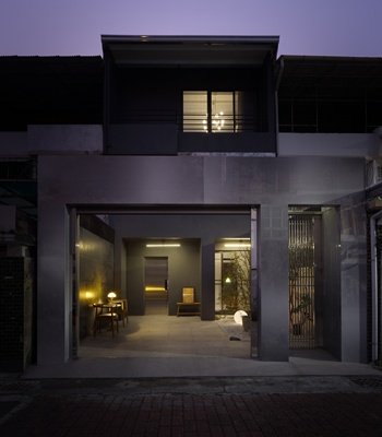
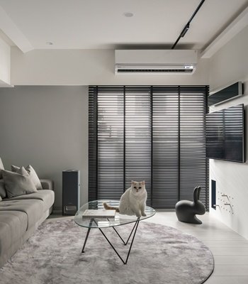
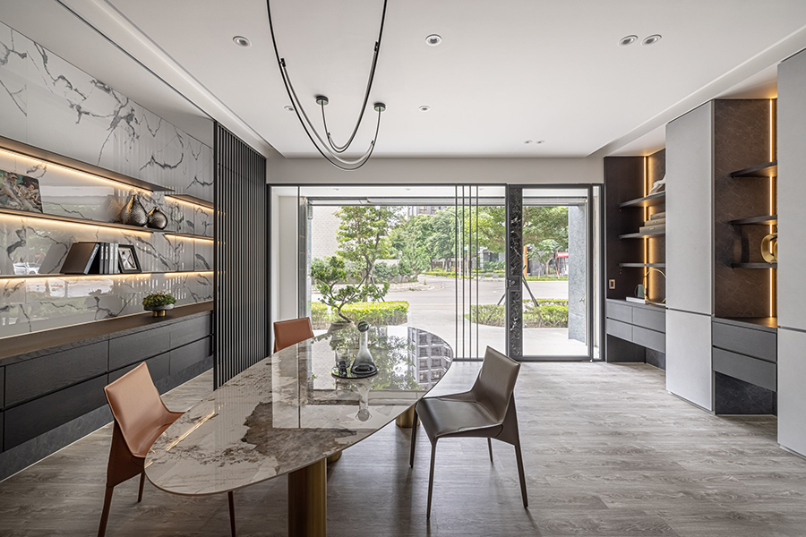
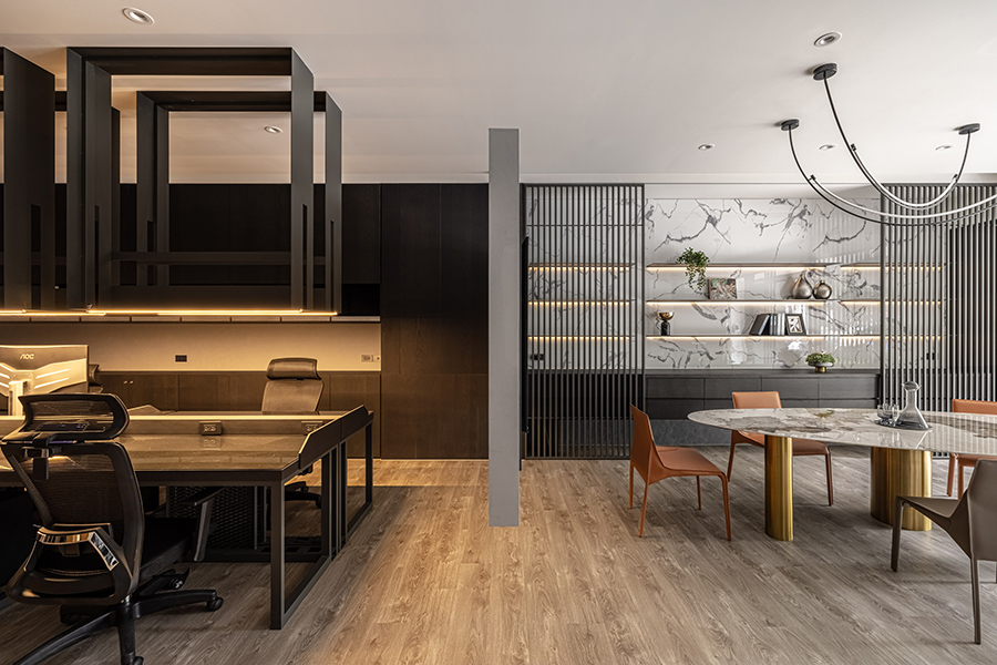
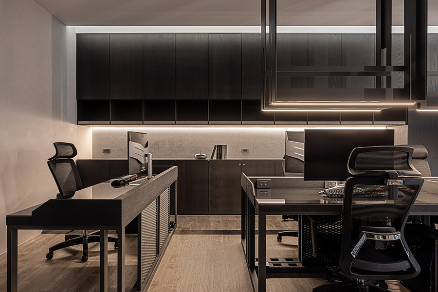
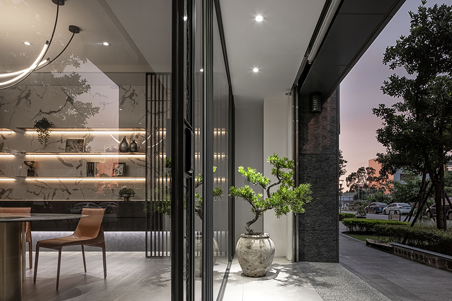
將空間簡單地劃分為辦公以及會客兩功能。前方以大片透明玻璃引進外面綠意風景,讓客人入門前即可看到代表公司的風格框景。以不規則形狀的微橢圓桌面,搭配三金屬支撐柱,創造有趣的視覺焦點。格柵的垂直、架面的水平、天花的拋物線,在不同角度裡,交織出多樣的線條畫面。櫃體的設計多以漂浮、簍空的方式呈現,讓收納需求不造成沈重,反倒輕盈通透。
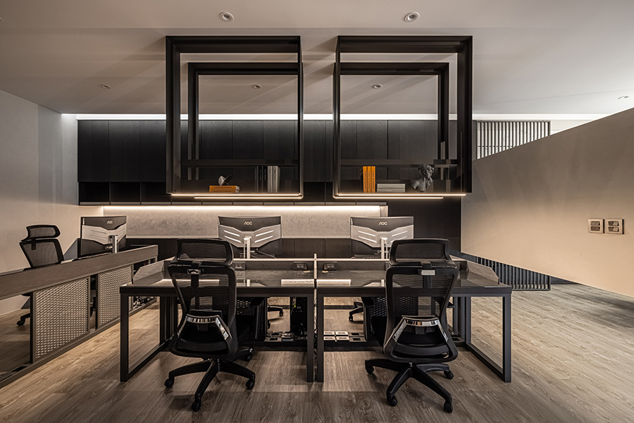
中間則以水平橫豎的電視牆將空間劃分,一方面向外展示、保留隱私,一方面讓空氣陽光由上方流淌。長型的桌面與燈條引導視覺效果至終端的大桌面。天花板大方型吊掛的架體巧妙運用平常用不到的高度空間。
以電視牆和不同的色調氛圍劃分整體空間,打造小坪數卻開放流通的辦公環境。用裝潢的細節,表現業主對室內設計的專業追求。
A space can encapsulate memories, while the designer’s careful touch can shape the container of life, allowing one to collect important moments of daily living. Holding on to this belief, Xingshi Studio wishes to present itself with a trustworthy impression and professional attitude to its customers, through a comfortable, open-plan and luminous office design. With the use of wood, natural stone flooring, metallic materials as the basis, the overlapping geometric shapes and lines as the main elements, features of high-rise, floatiness, hollowness and warm lighting contribute to the overall atmosphere. In addition, good natural lighting and ventilation nicely set off the elegant environment. Lines and shapes are integrated everywhere, while warmth of lights holds the display carefully. All the details are meant to speak for the profession.
The space is divided into the office and the meeting area. A big-sized floor-to-ceiling glass panel introduces the greenery from the outside, allowing customers to see the picture frame of the company before entering. The irregular, quasi-oval, geometric shape of the table is supported by three metallic pillars to create an interesting visual focus. The vertical lattice, horizontal shelving, and parabola trajectories on the ceiling interweave into diverse paintings from different perspectives. The cabinets at the back are presented to be floating and hollowed to make storage and display less bulky but much more lively.
In the middle of the space, there is a TV partition standing horizontally from the side wall, facing outwards for display but also to keep privacy, boost ventilation and introduce sunlight from upper and lower sides. The long perpendicular table and strip lights in the office area guides the visual attention to the big table at the end. The ceiling mounted shelves above ingeniously improve the space efficiency.
The TV wall and different color palettes with different vibes divide the space into two areas, creating an open-plan working environment that is small yet fluid and airy. All these details show the owner’s professional attitude in interior design.
國際獎項報名代辦洽詢專線:02-2799-7723

