描述
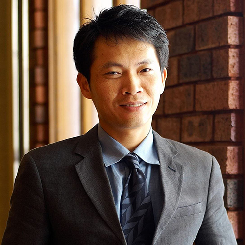
萱源實業-陳楷博
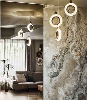
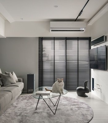
本住宅規劃設計案為三代同堂使用二十年的老屋翻新,我們在修繕部分,解決漏水問題,並架高地坪改善傾斜問題,修補外牆等以鞏固設計的基礎。設計面及材質使用上,大量運用自然石材紋理與原木,表達仿若身居自然山嶽之中。萃取-泉、石、木,沉穩靜逸的特質,婁空與錯落的光影點綴,彷若樹蔭交疊,石紋繖落其間,營造出簡約而安定心靈的新生老宅。
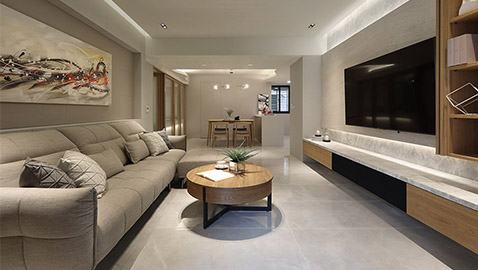
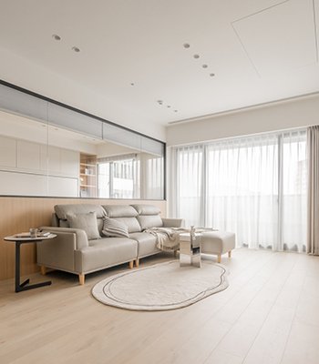
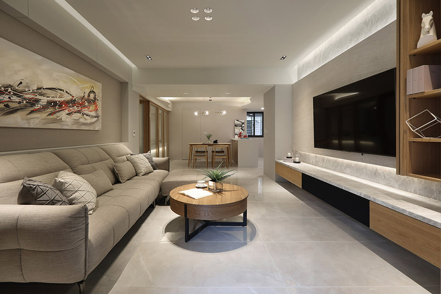
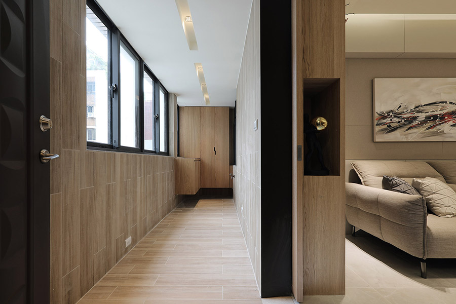
規劃上以向軸線做為空間分界的基礎,運用木質櫃體圍塑出長型玄關區,以阻擋直視餐廳的視線,並界定場域。長間公共空間的外側為客廳,以大量木質收納構成立面基礎,淨白的兩層式石材面電視牆,除了富層次感,更運用其潔淨色彩,表達”泉”的概念,細膩的間接燈源設計,更彰顯出石材的細緻紋理。
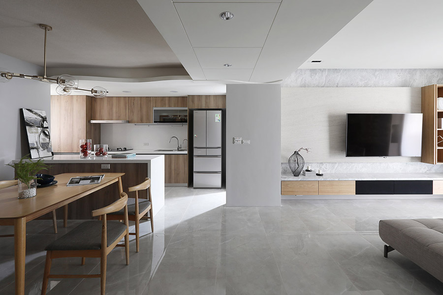
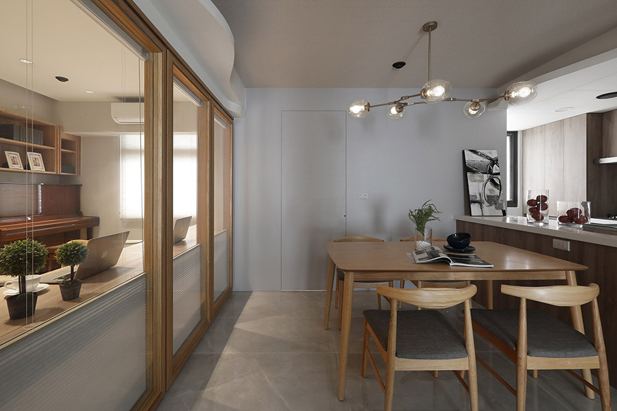
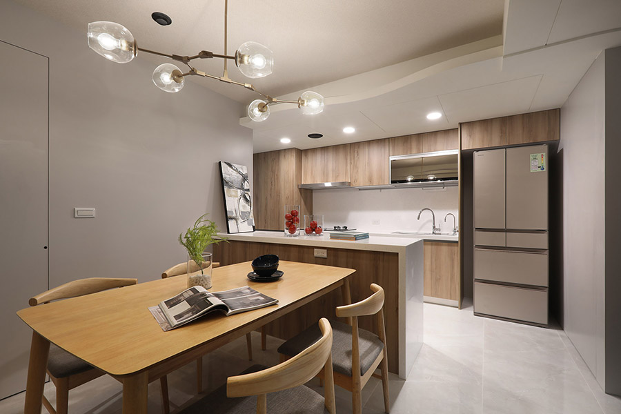
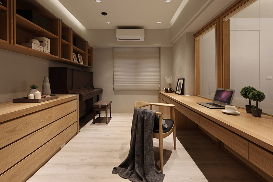
本案亦有樑柱問題,為化解餐廳中央的橫樑,將天花分為三等份,把大樑部分拉平,並採溝縫造型美化餐廚區,並將樑下空間規劃為收納區,擴充儲物機能,改善老屋既有問題,重新成為使用優勢,半開放式的餐廚,以木質系的色調,重新建構出”木”質調空間。後方則以玻璃隔間,規劃書房兼琴房的使用空間。
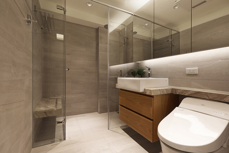
主臥延續設計概念以大面積天然木質作為牆面。而孝親房內配置無障礙衛浴設備,地坪使用鑿面板岩磚提高安全性,為體貼全齡的設計之處。全案以人的日常使用優先考量,屏除多餘的雕飾,探討人與自然的關係,並利用梁柱的重疊交錯,動線的迴遊與逗留,直線與斜角排列,引導出生動的視覺韻律。
The residential planning and design case was for the renovation of a 20-year-old residence where a family of three generations lived. With respect to home repair, we resolved the water leaking problem, elevated the floor to improve the inclination issue, and mended exterior wall to consolidate foundations of our design. In terms of designing and use of materials, we have utilized large amounts of natural stone patterns and natural wood to emanate the ambiance of living high amidst the mountains. Extracting the sophisticated and tranquil attributes of spring, stone, and wood, the hollow and scattered light shadows accentuate the space mimicking overlapping tree shades, while stone patterns are dispersed throughout to create a minimalist and peaceful reborn old mansion.
For the overall planning, axes are used as the bases for space partitions. Wooden closets surround and shape the elongated entrance area so direct view of the dining room is blocked and areas of varying functions are set apart. The long corridor of public space outside is the living room, where a large quantity of wooden storage spaces is built as the foundation of vertical surface. In addition to its layering visual effect, the pure white double-layered stone surface TV wall further conveys the concept of “spring” through the use of its refreshing colors. Design of exquisite indirect lighting also brings out the fine patterns of the stones.
This case also faced the issue of its beams. To work with the crossbeam at the center of the dining room, the ceiling was separated into three equal sections. The major beam was flattened out and was designed into a groove ceiling to beautify the kitchen-dining area. Space underneath the beam has been designed as storage areas to expand storage capability; prior problems of an old apartment were resolved and turned into new practicality advantages. Semi-open kitchen-dining area was renewed with a “wooden” space via choice of wooden color tones. The space behind this area was partitioned with glass and designed to work as both a study and a piano room.
The master bedroom stays consistent with the designing concept and has a large surface of natural wooden material for its wall. Inside the elderlies’ bedroom, an accessible bathroom is present, where the floor is made of chiseled stone tile to increase safety and as a precautionary measure for all age groups. The whole project emphasized primarily on people’s everyday use and eliminated unnecessary decorations, as we delved deep into the relationship between human and nature. And by utilizing intricate arrangements of the beams, circling and lingering of flows in space, and the positioning of straight lines and bevel angles, vitalized visual rhythms were introduced to the space.
國際獎項報名代辦洽詢專線:02-2799-7723

