描述
在意設計- 李穎宗
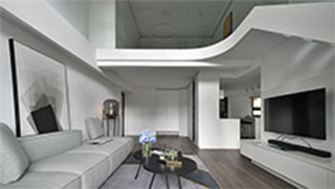
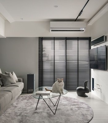
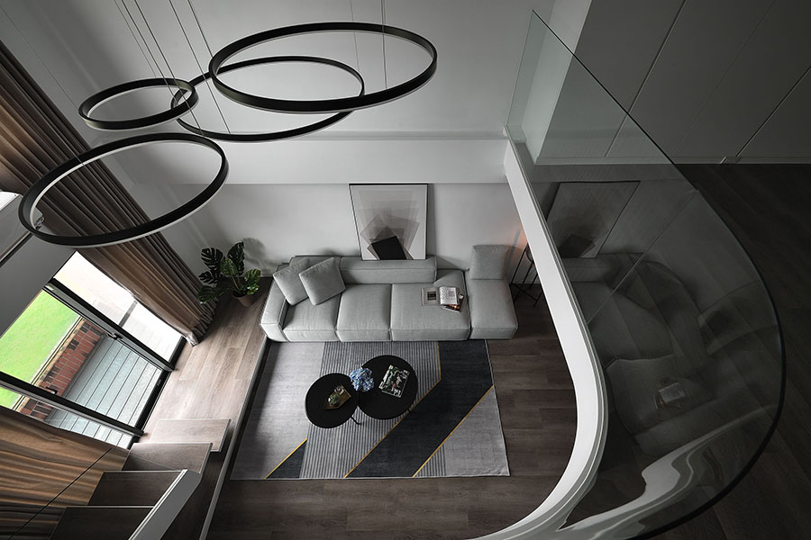
本案為減少空間太低、隔間繁複而導致的壓迫感,並跳脫傳統隔間模式,設計師將原為兩層樓的空間轉化為開放性的樓中樓,進而創造出舒適整潔、動線流暢的居住空間。簡約線條配上統一黑白色系,創造出純淨的空間和視覺享受。主張「沒有有障礙的心態,只有有障礙的空間」,設計師改變原先繁雜的格局,讓動線直覺化、光線色調自然化,回到家中自然而然能夠放鬆心情。
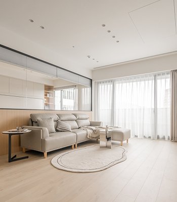
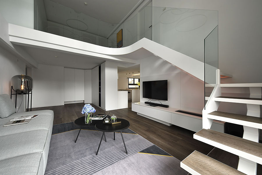
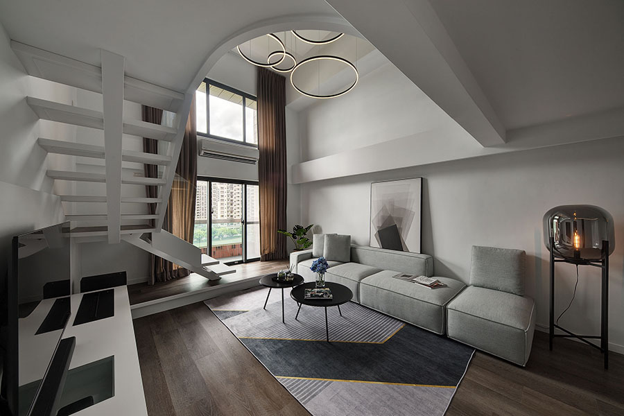
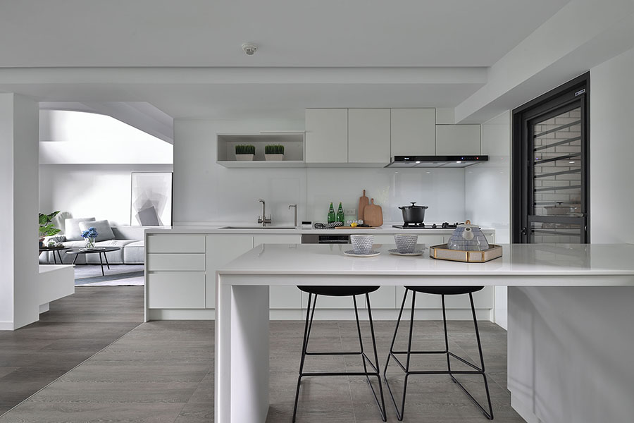
一樓的公共空間被分為玄關、客廳、廚房、餐桌四區。通篇的淡木質色地板,對比白色系的牆面、天花板、櫃體等裝飾,讓木質乘載重量。潔白的效果讓空間呈現輕盈無負擔的狀態。相較全開放式格局,廚房與客廳以木質地板的色差,輕巧地分隔出空間的界線。設計師以溫柔的手法,解決了30年的老屋間隔繁雜的問題,透過動線引導、半開放式格局、光影線條、玻璃使用,營造出圓滑通透感。
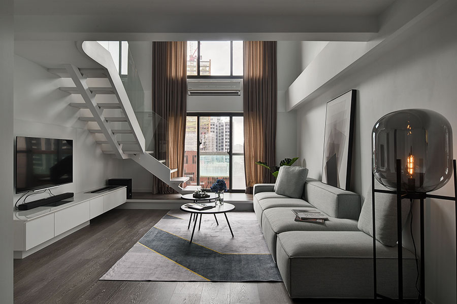
客廳至陽台處,以微微抬高的地面切齊陽台高度。同時也銜接至樓梯口,減少高低差帶來的不便。樓梯處原本急促上升的直線,透過圓潤線條、通透手法,創造流暢蜿蜒的體驗,顛覆了一般樓梯設計給人的空間壓迫與沈重。
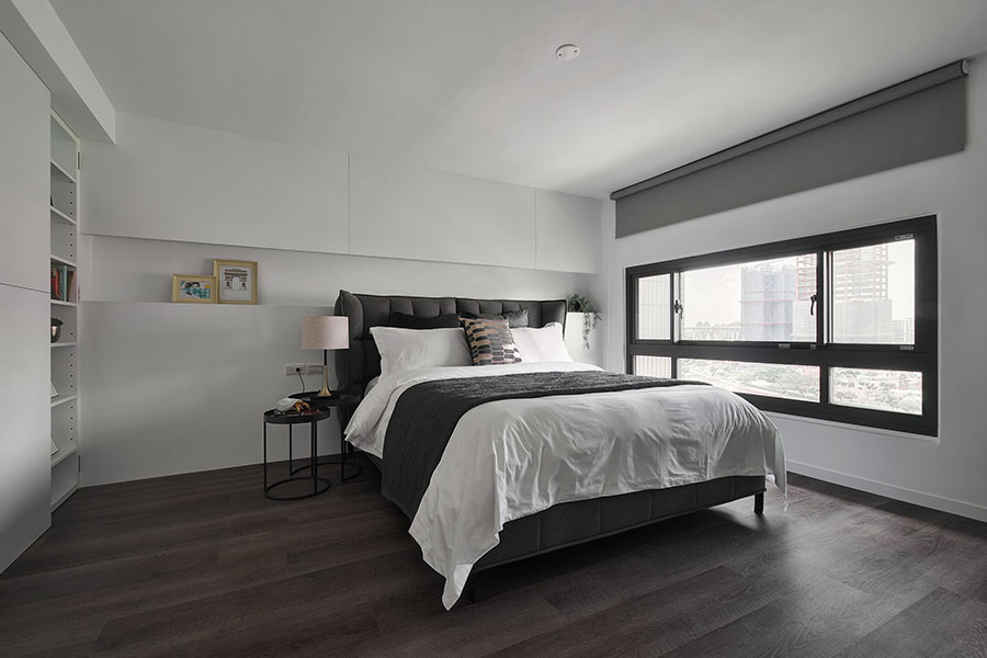
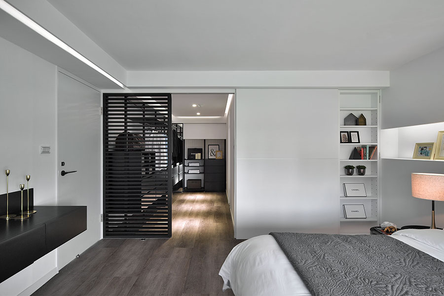
二樓外側以收納櫃體和空地留白,讓業主可自行規劃空間的使用功能。臥室採光佳,並以隱藏門櫃收納貴重珍品,通透的更衣室鐵件拉門,讓光線空氣穿透,整體空間簡潔、明亮。
材質與色調之簡化之餘,更在較低的樑柱位置、天花板接縫、櫃體邊緣,加入隱藏的鑲嵌線條燈光。修飾視覺上的障礙,並增添光影效果及空間流線感。白天時,可讓潔白空間更加明亮;夜晚時,則可讓整個居家空間有如暗夜中的流水光芒,打破限制、加強空間的感知,重新定義審視的角度。
To relief the oppression from low ceiling and complex partitions, and to break through the tradition layout, the designer transforms the originally two-story building into an open plan maisonette, therefore creates a cozy, tidy living space with smooth flow and fluidity. The neat lines with a cohesive black and white color palette together build a pure space and visual enjoyment. With the strong belief of how a clear space can uplift the spirit, the designer clears out the busy layout, intuits the flow and neutralizing the lighting and the tones, so that the residents can return to a comfy home to relax.
The common area on the first floor consists of the entrance, the living room, the kitchen and the dining room. The light wooden floor panels all going over the area, contrasting the white from the walls, ceiling and the cabinets, stabilize the space and create a visual focus while the lightness lifts the space. Instead of a fully open plan, the subtle color change between the kitchen and the living room cleverly draws the lines between tow areas without creating any barrier. Through a rather softer and gentle approach, the designer settles the problems of this 30-year-old house by semi open plan, flow guidance, arrangements of light and shadows, and the use of glass. The space is now smooth and fluid.
The gap between the living room and the balcony is now filled with a slightly lifted floor, the additional height also extends to the stairs, eliminating the inconvenience an uneven floor might bring. The stairs are adjusted into a meanderer style, which elongates the sight and creates a fluidity.
Up to the second floor, where the vocal point is rather invisible. With a wall of hidden cabinets and the blank space, the residents get to decide how to make use of the space. The main idea in the private area is more minimal, for after all the residents are the true master of the space. Bringing in sufficient natural light into the space and building hidden cabinet to store, the designer’s job here is to set a comfortable and relaxing scene for the residents to live.
The attention to details is on point, not only does the designer simplify the visual through colors and textures, he also adds in embedded lights to the lower beams, the seams of the ceiling, and the edge of the cabinets. With the lighting, the defects of the space is embellished, and also interesting visual effects come with the changes of light and shadow. During the daytime, the white becomes whiter with the lights shine on, while at night, the light is like water, flowing through the space, glistening. Through design, the boundaries and barriers and broken, and the ways of thinking a space is challenged.
國際獎項報名代辦洽詢專線:02-2799-7723

