描述
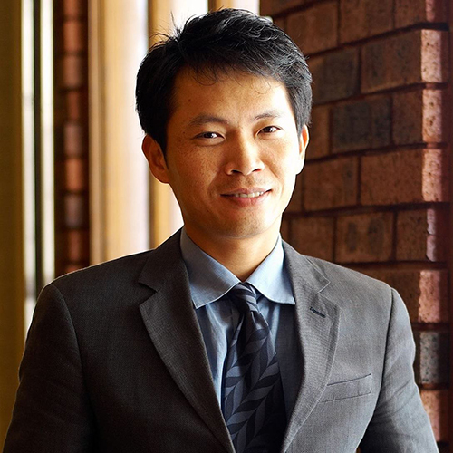
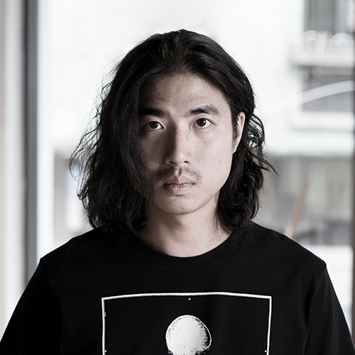
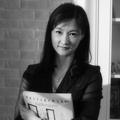
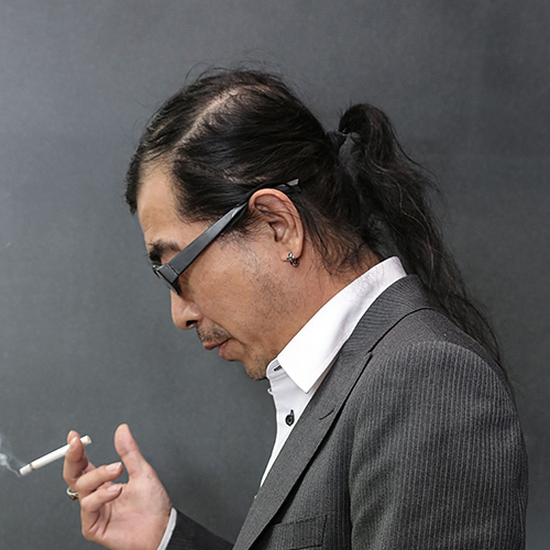
班堤設計- 曾傳傑
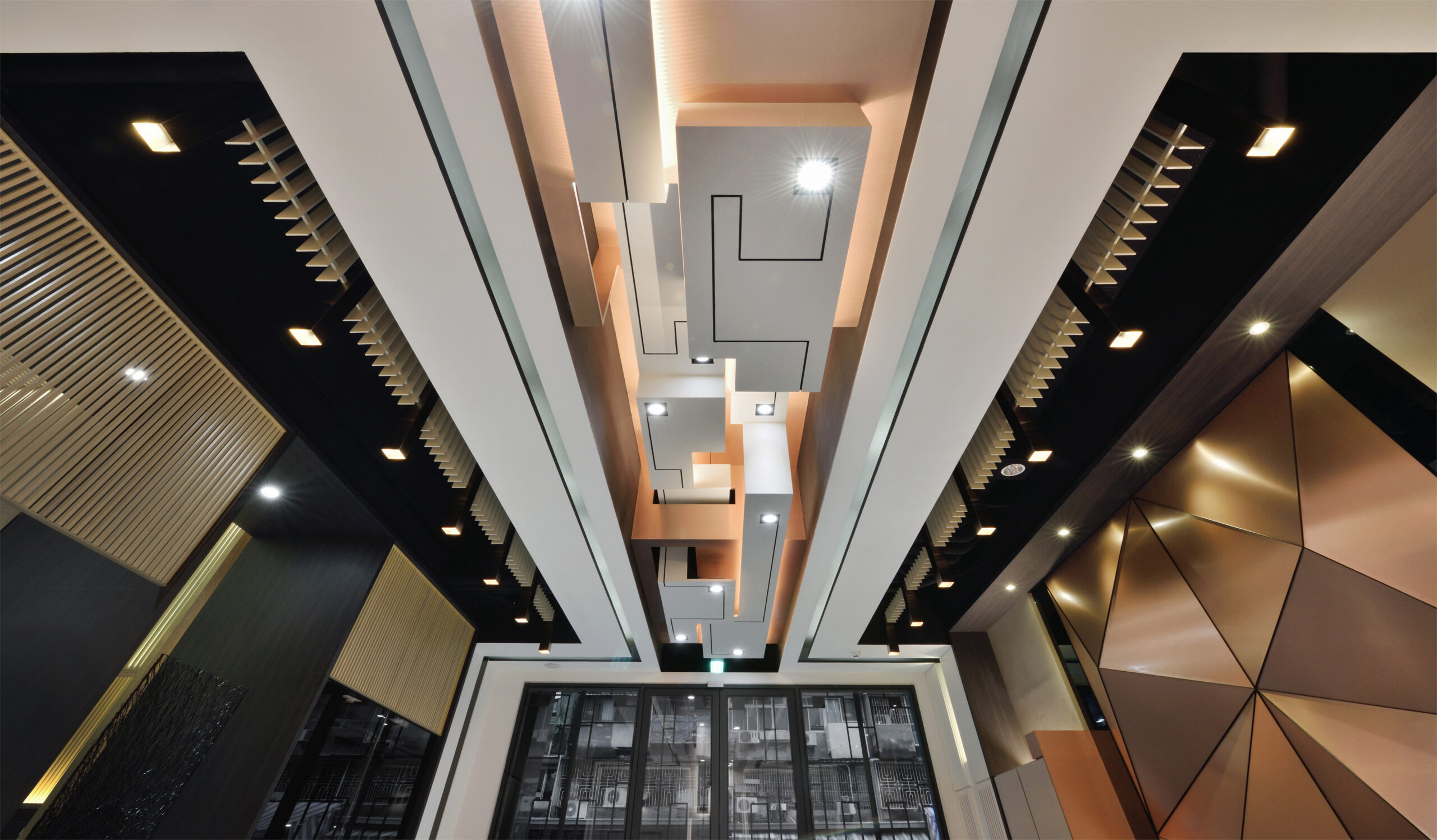
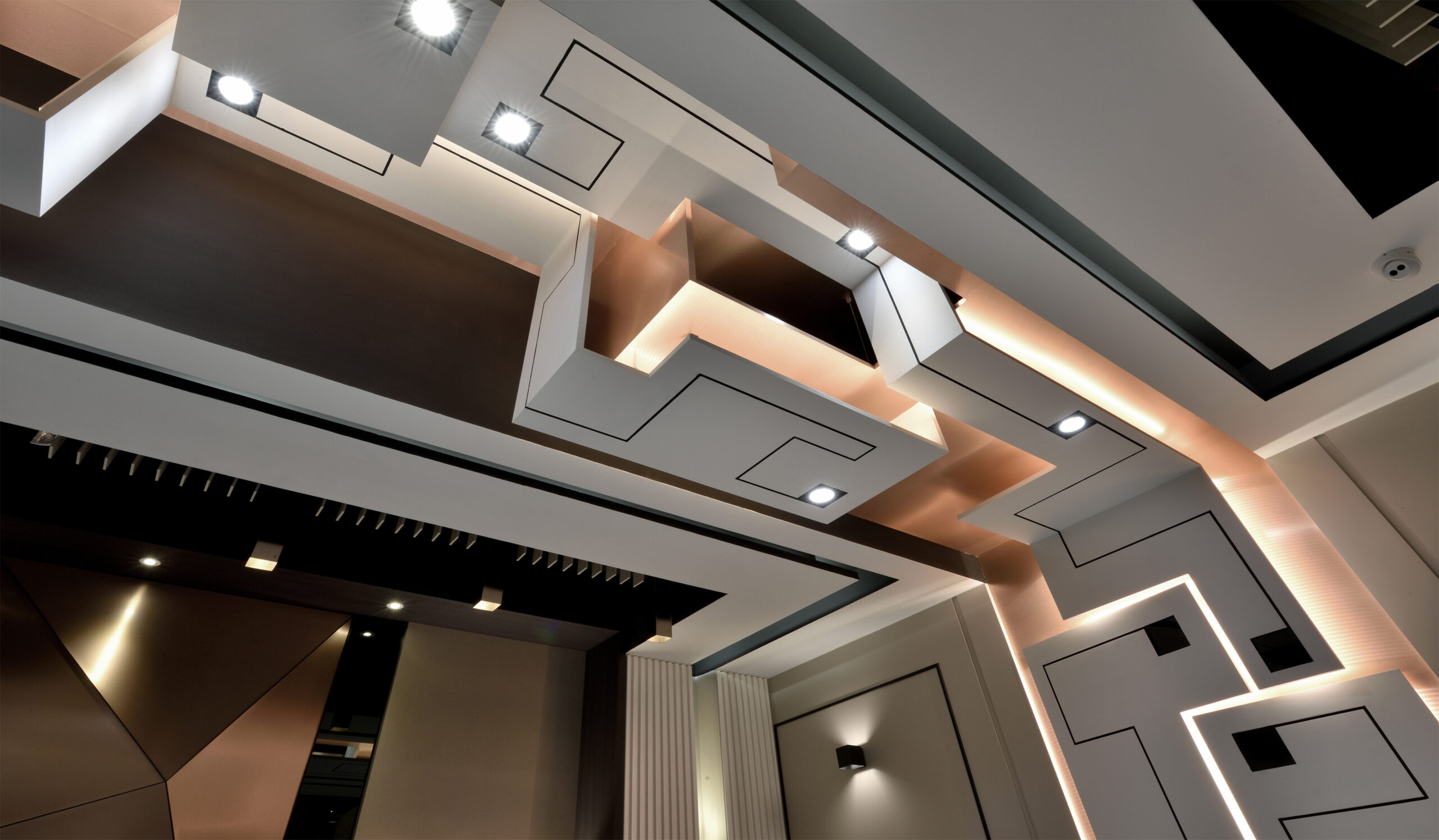
作品以基礎元素,點、線、三角形大量運用在空間。方點為基、折線為根 、三角為襯來營造本次作品。點與點之間連接線條以轉折形成特殊面感,不以整道壁面來呈現,利用線段轉折來展現一道虛實穿透的面,點與線延伸轉折出層次深度。且在現場條件下,以轉折手法由頂部延伸至牆面,使其成為空間中軸線的亮點其一。三點相接形成的三角形元素,依幾何關係互相拼接,不單侷限水平面創作,三角特性能以不同角度相接,使其平面造型以立體方式呈現。結合三角形特性與點線轉折手法是本次主要設計方向。
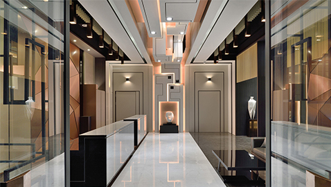
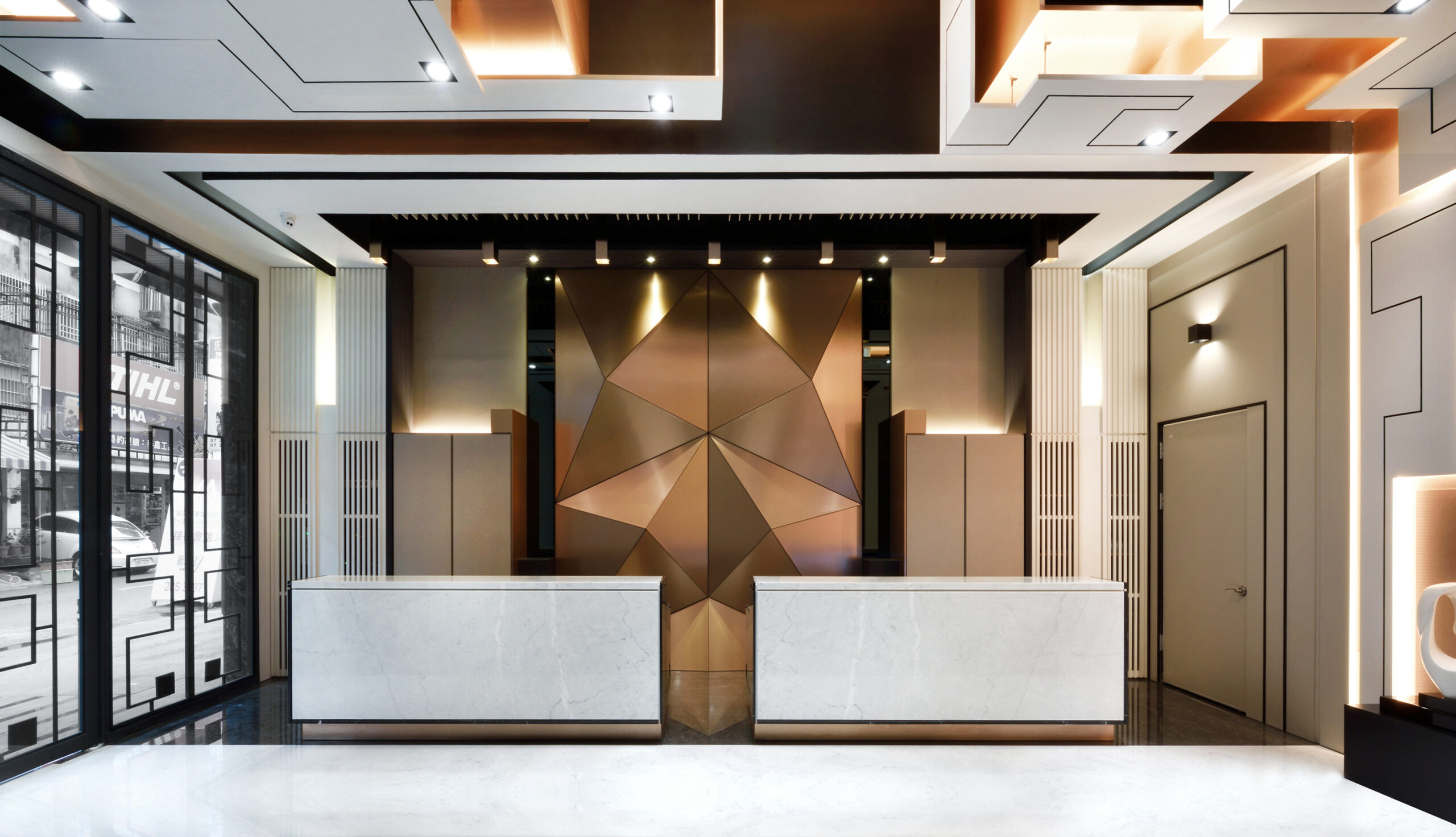
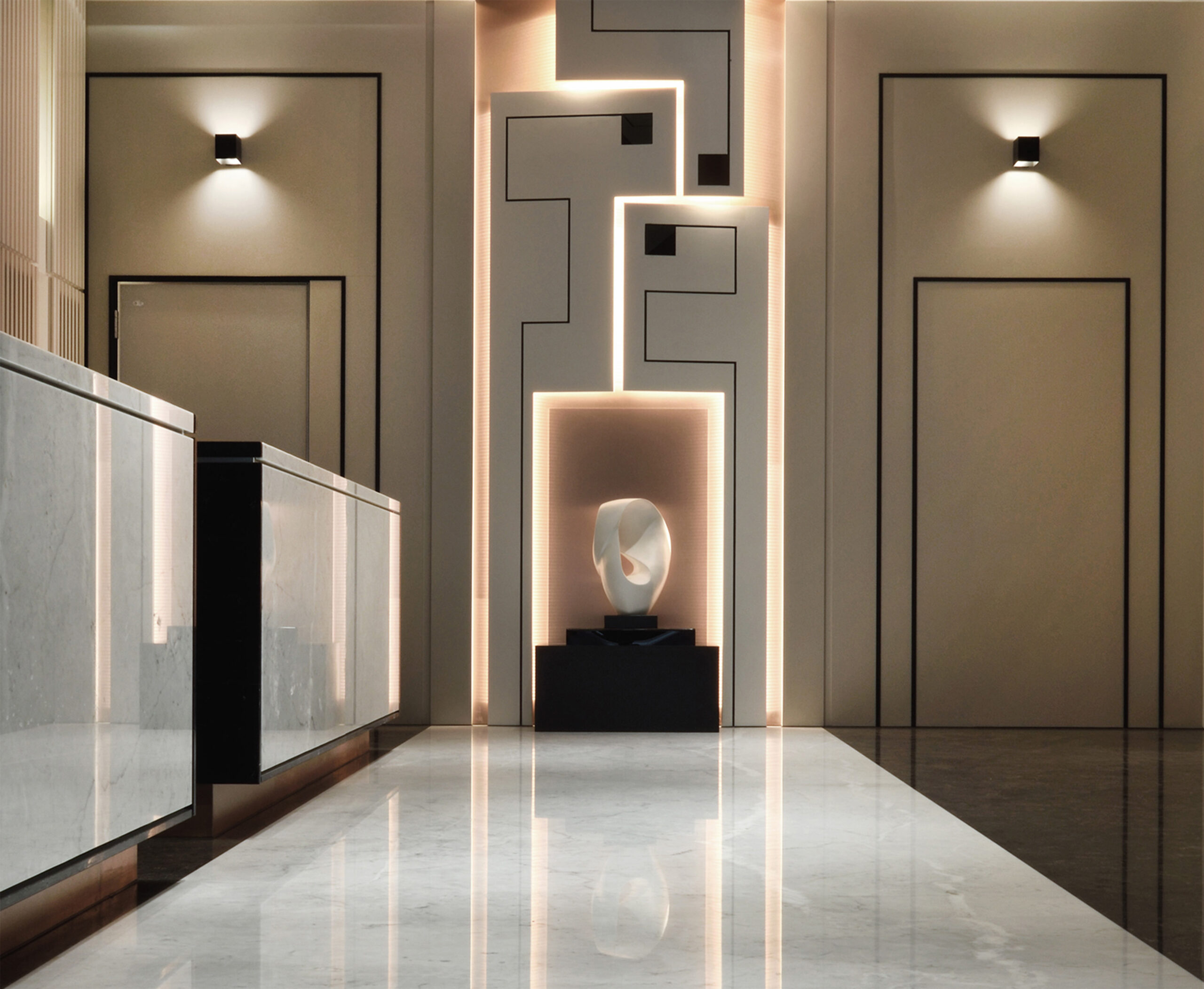
迎賓大廳入口,主大門方點與線條轉折元素的鐵件設計,大廳映入眼簾的是矩形板塊與線條轉折,交錯重疊出立體頂面造型。頂面造型延伸至壁面,不以平面展示,加入三角形元素使矩形板塊向外傾斜;光線從內散射,對應地面石材黑白分界與大門鐵件設計互相呼應,形成了一條現代時尚的視覺廊道視線,底端精心挑選的典雅雕塑,更是捕捉住造訪者的目光。
大廳內兩座接待櫃檯,對稱的坐落於三角金屬造型主牆前,白色石材散發的寧靜,黑色石材展現的穩重;提升整體空間氣度。
造型主牆大面積採用三角元素手法,利用金屬質感與立體分割,做出存在感強烈的壁面設計,呈現一幅搶眼的立體創作。
主牆左右兩邊設置了對稱的隱藏式機能櫃,巧妙利用轉折元素造型向上延伸至頂面,再轉折回對向立面,讓空間每道面都有其相互關係。此區亦依照沉穩色調搭配合宜沙發組,讓來訪貴賓稍作等候外,能欣賞大廳藝術廊道的氛圍。
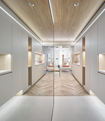
空間中區,是橫向與縱向軸線交錯處。做為過渡空間。大量的原木條佇立於壁面,延伸至頂面再轉折於立面,半穿透框架區隔出梯間、過道、展示區與信箱間的機能屬性。
框架區隔中,選材色系刻意選用深色調,保留挑高空間感;在重色調中置入白色大理石台,光影展現大理石台上鋼藝作品的張力與透視感,營造空間亮點。
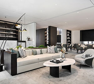
在視覺穿透感的帶領下,步入交誼會談區。交誼區採用水平分割,上方剛性有條理的展示層櫃;下方柔性舒適坐椅區。讓人不禁駐留於此;以恬適雅致的心境欣賞環境氛圍.
會談區設備主牆同樣表現設計重點,點線轉折手法,中間整道深色木紋主牆,二側底牆選用肌理感岩板、玫瑰金方點與線段轉折格柵,透過光影拉出視覺焦點,同時也與前區大廳元素呼應,營造整體風格。
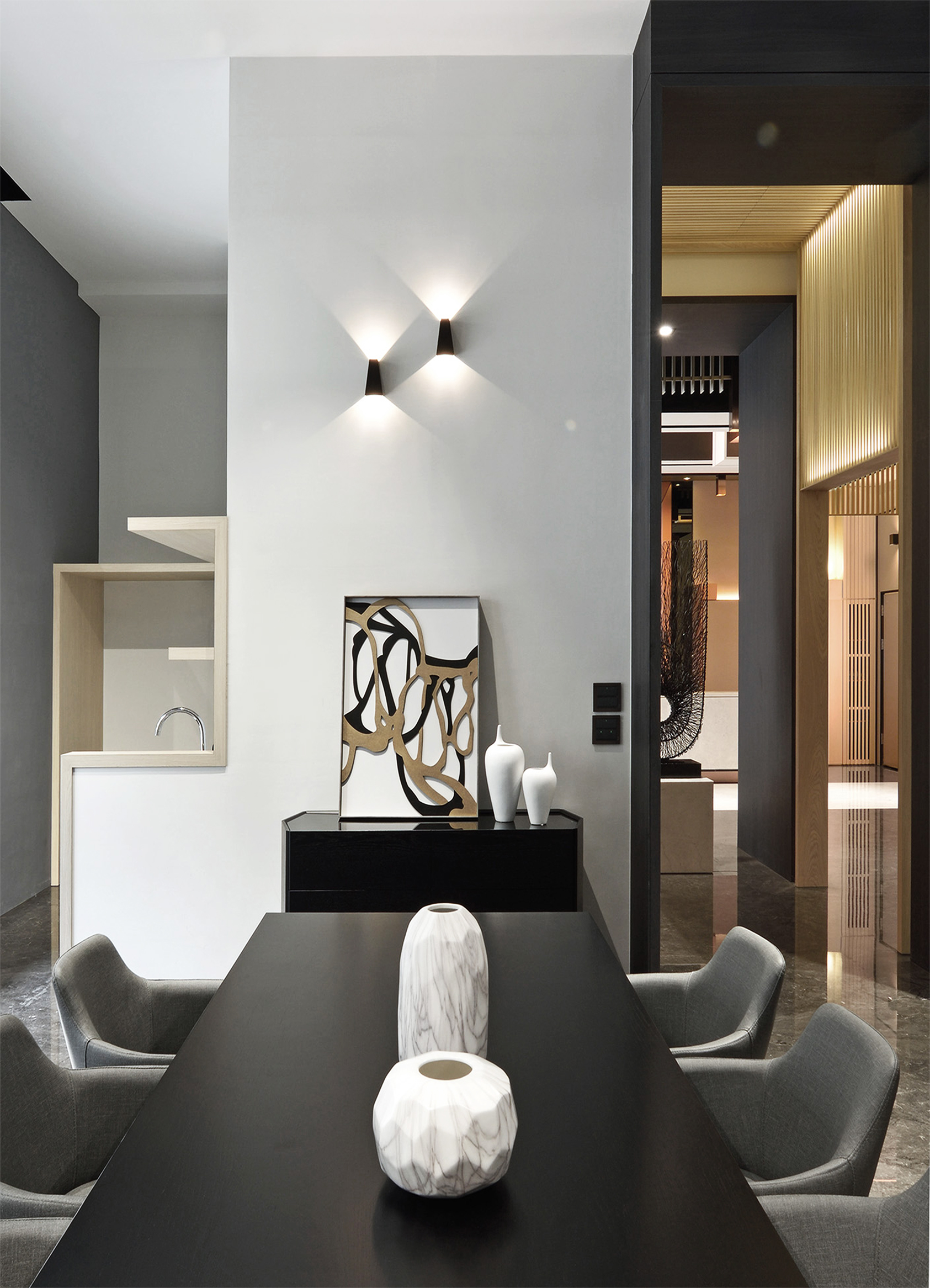
此區大面積白色簡約頂面,加入黑色線條方框,軌道投射燈藏於方框,來擔任光源的主角。在乾淨簡約的頂面中,滿足光線需求。而主牆對向潔白珍珠漆牆面及幾何壁燈,點襯出投射光束的俐落美。
The works use a lot of basic elements in the space, including points, lines and triangles, among which square points are used for the base, broken lines are used for the root and triangles are used for the lining to create this work. The connecting line between point and point forms a special feeling of surface by transition, instead of presenting the whole wall surface. It uses line segment transition to show an imaginary and solid penetrating surface, and the extension of point and line gives a depth of layer. And using the transition technique from top to wall make it become one of the bright points of the axis in the space under the site condition. The triangular elements formed by the connection of three points are stitched together according to the geometrical relationship, which is not limited to the creation of the horizontal plane, the triangular feature can be connected from different angles, making the plane shape appear in a three-dimensional way. The main direction of this design is the combination of triangle property and point line twisting technique.
At the entrance of the welcoming hall, there are iron designs of the square point of the main gate and broken line elements. The hall is greeted by rectangular plates and broken lines, overlapping and making a three-dimensional top shape. The top shape extends to the wall, not shown in a plane, but with triangular elements to make the rectangular plates tilt outwards. The light diffuses from inside corresponding to the black and white demarcation line and echoing to the iron design of the door, together forming a modern and fashionable visual corridor. The elegant sculpture at the bottom, carefully selected, captures the visitor’s gaze.
There are two reception counters in the hall. They are symmetrical in front of the triangular metal modeling main wall, and with the tranquility that white stone material sends out and the sedate that black stone material shows, the overall spatial tolerance is improved.
A large area of the modeling main wall adopts the technique of triangular elements, making use of metal texture and three-dimensional segmentation to make the wall surface design with a strong sense of existence, presenting an eye-catching three-dimensional creation.
Concealed function ark are set symmetrically on both sides of main wall, which cleverly use transition element modelling to extend up to top face, then turn to face a facade, letting each face of the space have mutual relation. This area also collocates suitable sofa group in a composed tone, letting the honored guest appreciate the atmosphere of the art corridor of the hall while making a little wait outside while.
The central are of the space is where the horizontal and vertical axes intersect. It is a transition space. A large number of logs stand on the wall, extend to the top and then turn to the facade, and semi-penetrate the frame area to separate the functions of the stairway, the corridor, the exhibition area and the letterbox.
In the frame partition, deep color is selected deliberately for material color, keeping the high spatial feeling. The white marble table is placed in the dark color, and the light and shadow show the tension and perspective of the steel art works on the marble table, creating the space highlights.
Under the guidance of vision penetration, enter the Fellowship area. The Fellowship area is divided horizontally with a rigid and orderly display cabinet on top and a flexible and comfortable seat area at the bottom, making people stay here to enjoy the environment and atmosphere with a comfortable and refined mood.
The main wall of the equipment in the meeting area also presents the key points of the design, the point line twisting technique. The whole main wall in the middle is dark wooden grain, the bottom walls on two sides use texture sensitive rock plate, rose golden square point and grid with broken lines to pull out the visual focus through the light and shadow, at the same time echoing with the front hall elements to create the overall style.
A large part of this area uses white and simple top surface and add black line box. The track projection lamp hides in the box and serve as the main light source, meeting the demand for light in the clean and simple top face. The main wall is opposite to the white pearl paint wall and geometrical wall lamp, and setting off the smart beauty of the projected light.
國際獎項報名代辦洽詢專線:02-2799-7723
