描述
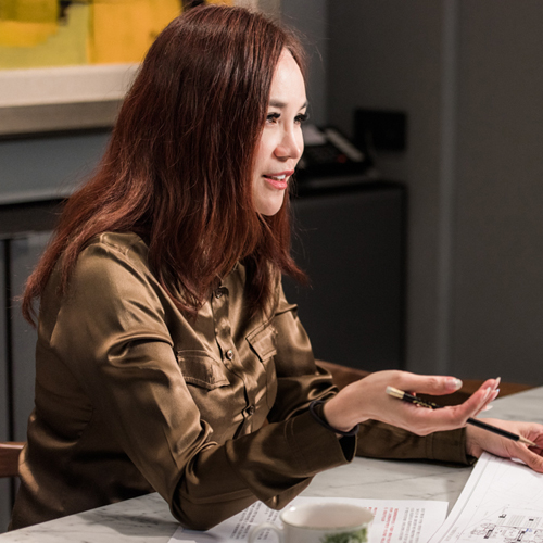
大塊設計- 施佑霖
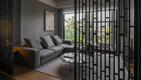
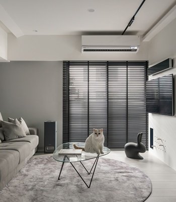
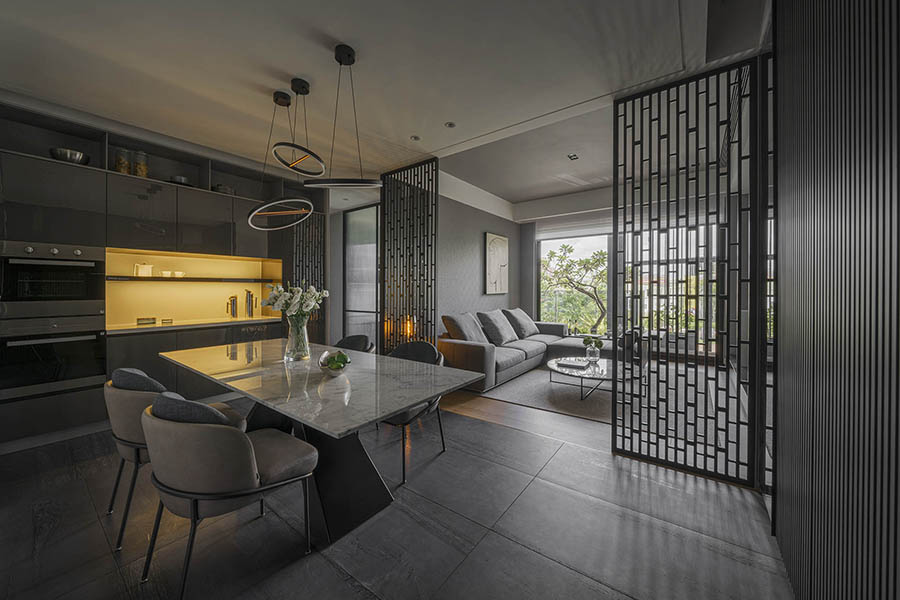
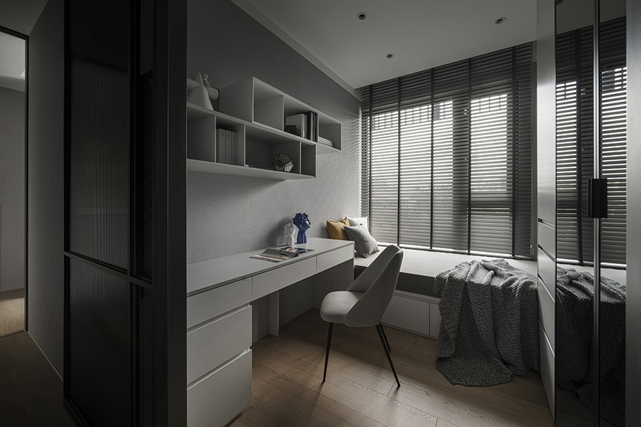
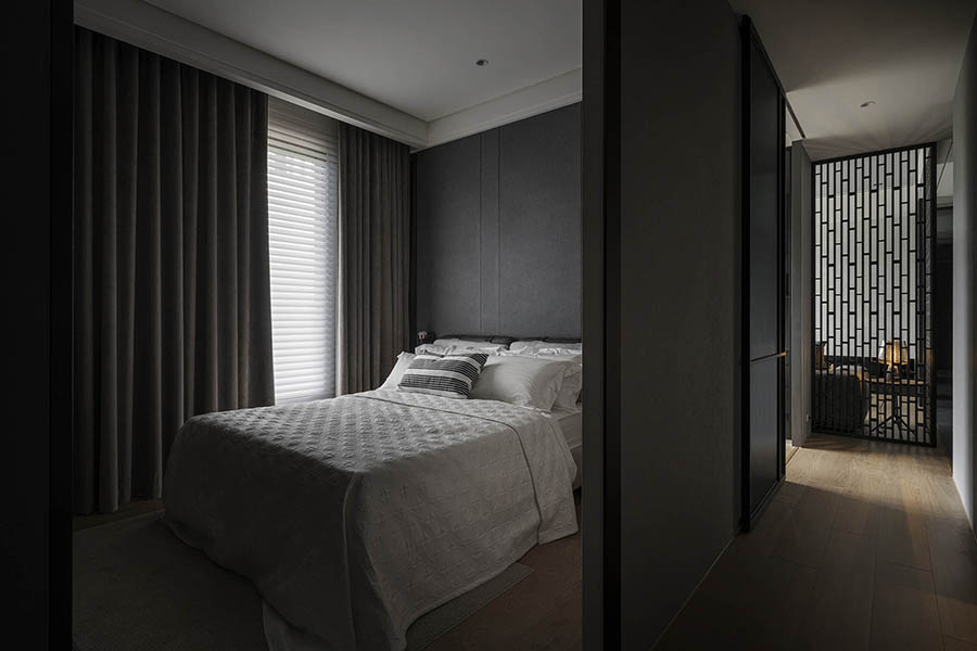
設計師透過精巧的格局設置,靈活運用空間的每一個角落,並賦予每一個區域獨特的個性,展現出空間的多變性。冷色調為主的空間在精心的燈光妝點下顯得溫馨有致,別具巧思的燈具更為空間帶來了一點活潑的氛圍。特殊造型的簍空屏風在分隔空間的同時保留了穿透性,在視覺上增添了不同的層次。透過設計,空間以極具邀請性的姿態,歡迎訪客們一同暢想家的無限可能。
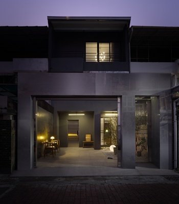
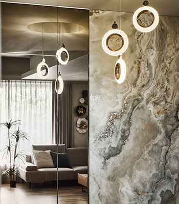
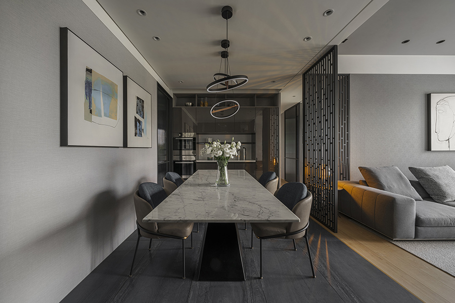
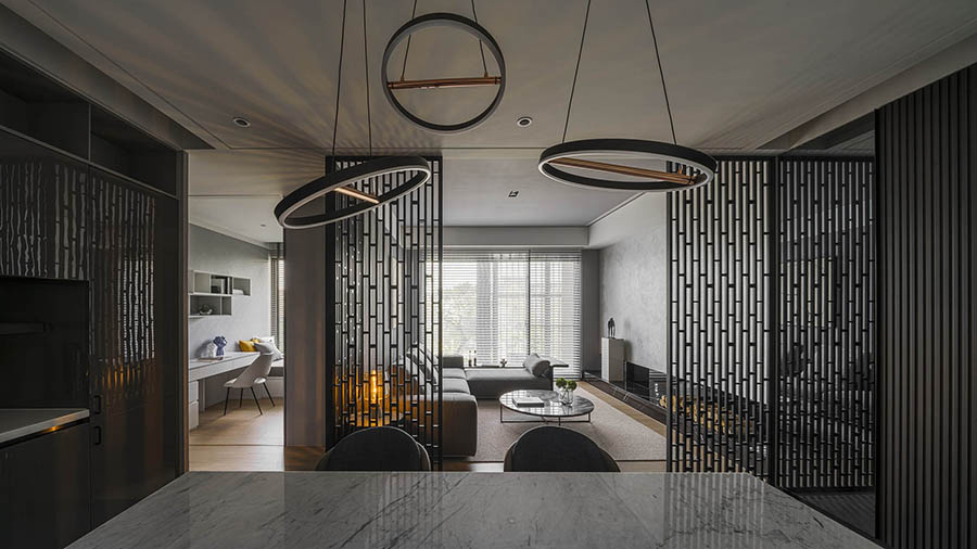
深色牆面與地面讓狹長的玄關顯得俐落不狹窄,大面積相間的鏡面則擴大了視覺效果,配合隱藏式的收納空間,展現了精準的空間運用。公共領域採開放式格局,以簍空的屏風隔板淺淺的將餐廳與客廳隔開。陽光透過落地窗,灑落在屏風之上,形狀奇異的光與影旋即填滿了空間,成為空間中最美的裝飾。從玄關延伸至餐廳的深色石材地板素雅簡潔,兼具美觀與功能性。上方設計師則使用了造型活潑的圓形燈具。線條的外觀維持著簡潔感,起伏的曲線卻創造出動能,讓空間活躍起來。
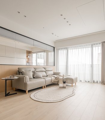
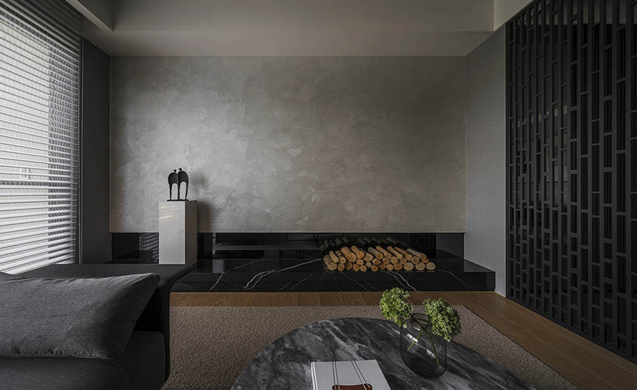
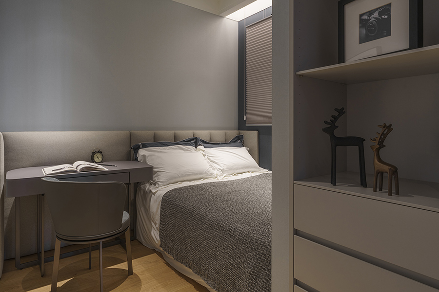
客廳則是另一番風景。屏風穿透的特色在維持視線流動性的同時仍然了保留了空間的私密感。寬敞的空間搭配大面積的開窗,營造出舒適的起居區域。仿清水模的牆面下方拼接深色的大理石檯面,營造出素雅穩重的氛圍。設計師選擇不裝設電視,而是保留牆面淨空,僅用藝術品妝點。透過這個簡練乾淨的空間,設計師希望提醒訪客,與家人共處的時光是平靜安逸,且不應受外在世界打擾的。家人們能在客廳中遠眺窗景、相互依偎、分享心事,能在餐桌上談笑聲風、享受美食,在各自的房間中放鬆身心……設計讓空間回歸家的本質,乘載著家與人的點滴。
The designer comes up with a delicate layout and utilizes every inch of the space, characterizing each section with its own flare, therefore shows the versatility. The warmth of the lightings brings coziness in this cool tone space, and the unique design also lightens up the vibe. The customized screens with hallow-craved keep the transparency while parting sections, which enriches the visual layers. Through the design, the space invites all the visitors to let their imaginations run wild in a welcoming way.
The dark color of the walls and floor make the narrow entry sleek yet uncrowded, and the use of large mirror visually widens the space. Alongside the hidden cabinets, the designer shows great skills for space management. The public area is an open-plain layout, with the see-through screens stands ajar between the living room and the dining room. The sun shines through the French window and cast shadows through the craved-outs. The oddly-shaped shadows and the beam dance around the space throughout the day, becoming the most dazzling decoration of the space. The dark stone floor extending from the entry to the dining room is neat and easy to clean while still atheistically pleasing. Above hangs the vibrant-style lighting. The linear shape keeps it sleek yet the curve lines create a dynamic in the overall elegant ambience, and enliven the space.
The view changes in the living room. The see-through screen keeps the intimacy of the space even with its transparency. The spacious room with the French window and the natural light establish a comfortable place to stay in. The main wall is applied with faux exposed concrete, and downward it is patched to a dark marble counter. The steadiness of the stones stabilizes the space. The designer opts out the idea of having a TV is this calming space. Instead, a few pieces of artwork are displayed along the empty wall. This is the reminder from the designer to the visitors, that the time with family should always be calm, comfortable, and unbothered by the outside world. Family members are able to hang out in the living room, enjoying the view, cuddling each other, or sharing their hearts. In the dining room, they can have wonderful time preparing and appreciating the food, and at last, when the night is dark, they can return to their own room and relax. Design allows the space to go back to the essence of home, where family lives and makes memories.
國際獎項報名代辦洽詢專線:02-2799-7723

