描述
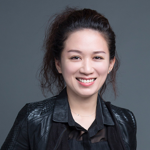
橋・空間-鄭騰晉
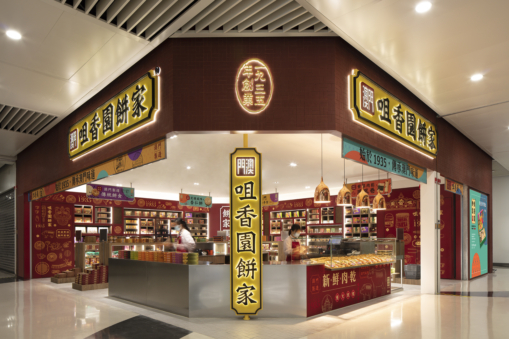
以「歷久彌新」為設計概念的主軸,透過重新包裝,讓咀香園傳統餅舖的歷史底蘊越陳越香、值得回味。 為保留產品的經典純粹、糕餅質樸的溫暖味道,將新元素注入在包裝、服務、設計中。透過各方面的優化設計,體現出企業所具有的文化底蘊。
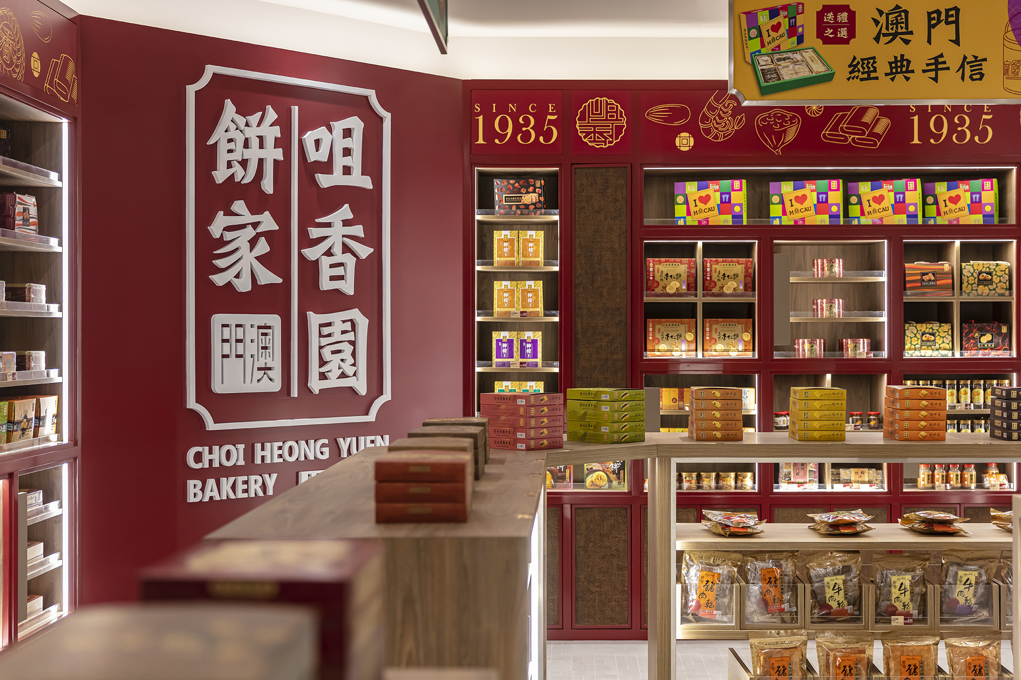
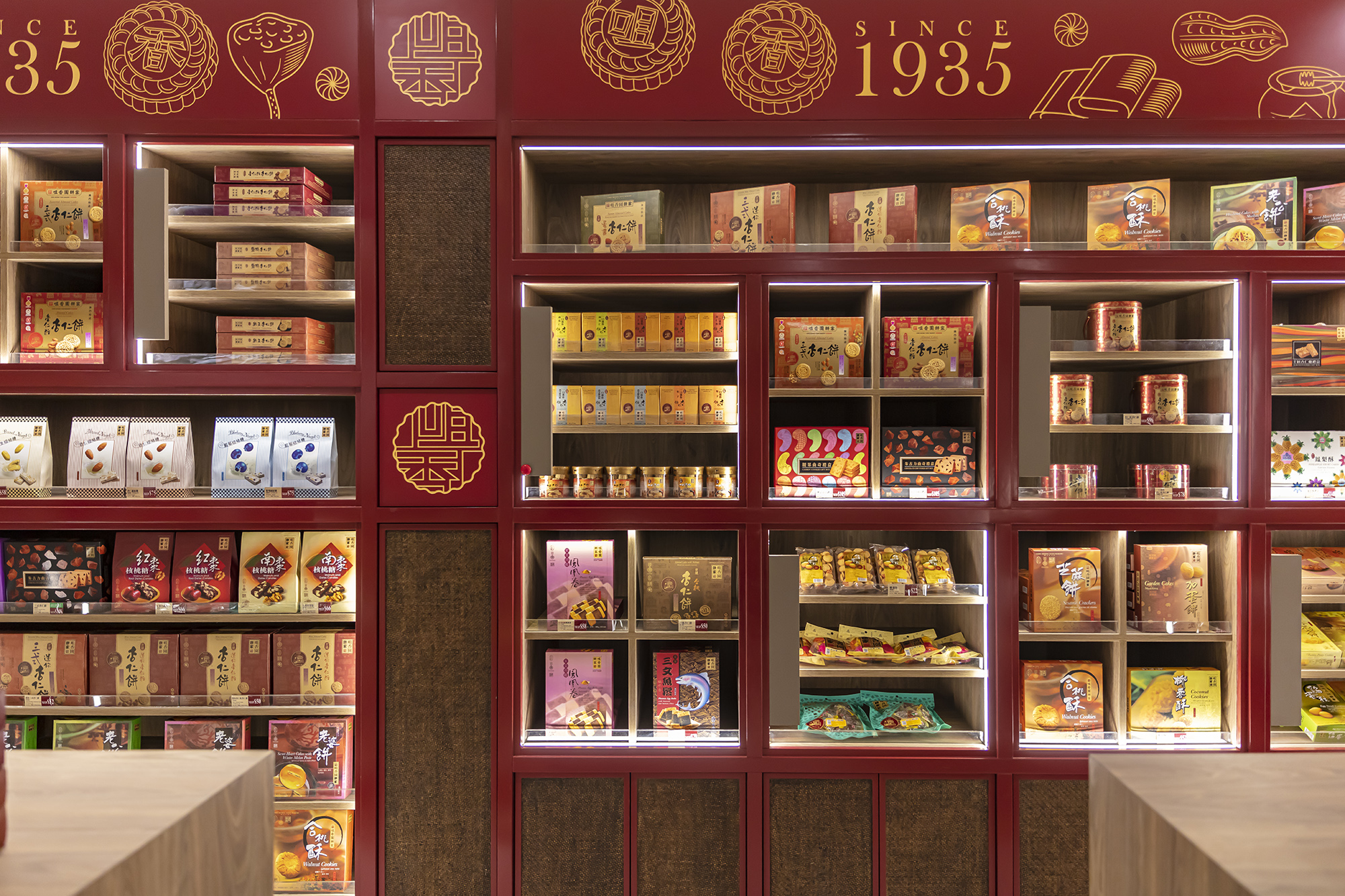
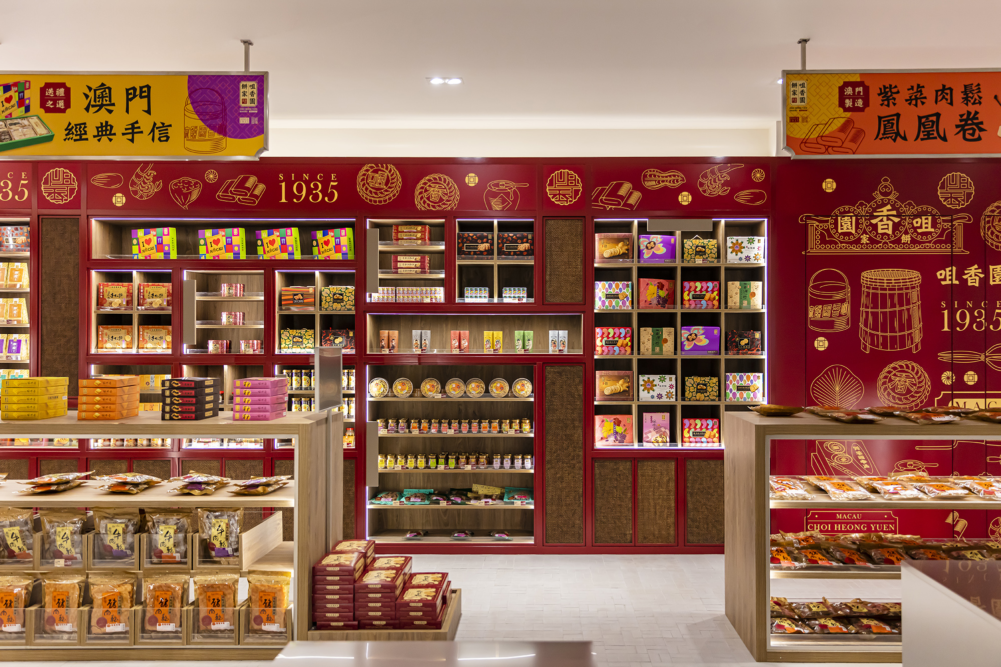
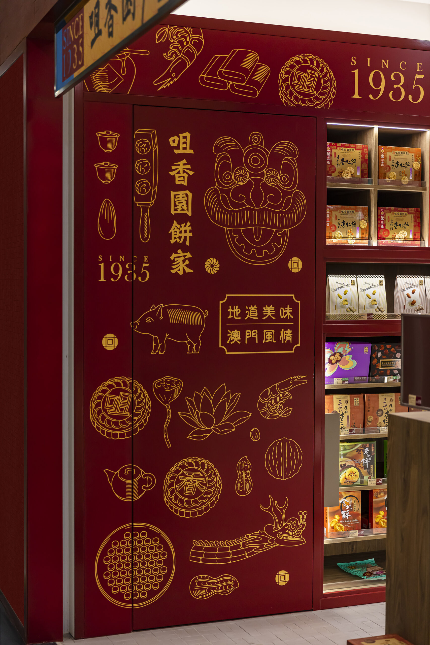
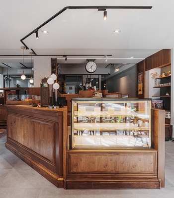
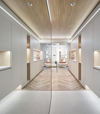
咀香園零售餅舖整體空間清晰明亮,以簡約線條做多樣變化,各展櫃框架與動線規劃流暢整潔。透過質感豐富的材質,帶出傳統手藝的意涵。使用澳門傳統的紙皮石,以新的色澤和質地重新塑造。透過比例的放大,將懷舊線條用於櫃組造型上。同時與品牌設計方合作打造了高櫃上充滿活力的圖案,以壓克力底板、鐳射切割的方式呈現。
一間融合經典與新潮的傳統店鋪,迎合了不同年齡層的喜好。不死守一般傳統餅鋪的拘泥於舊,或只追求最新潮流導致長輩購買意願的降低;而是在創新的同時,保留了經典的元素。透過細節,以不同的方式觀看世代傳遞的記憶與情懷。
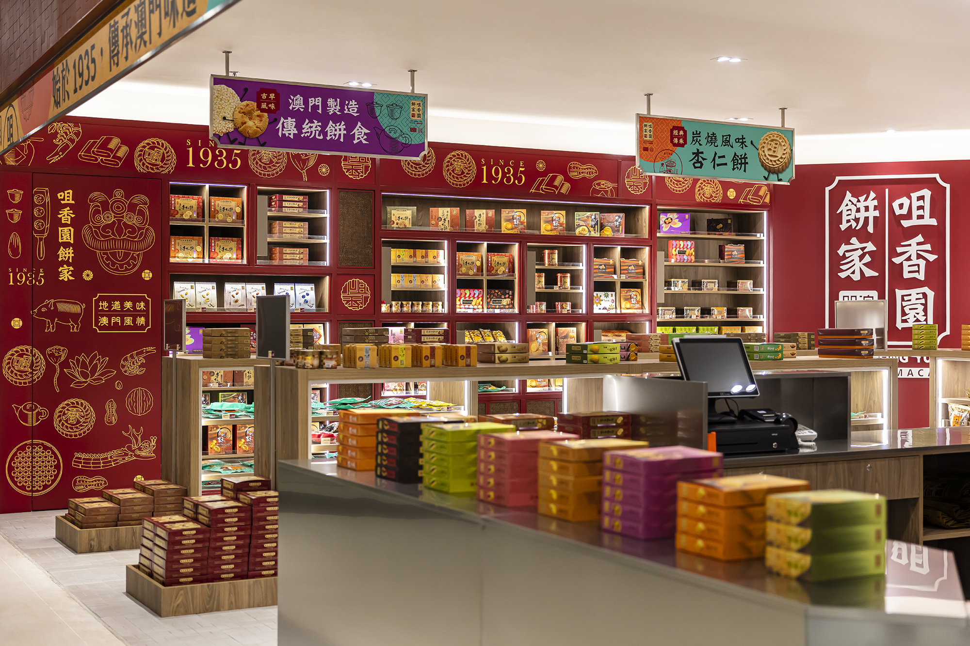
為了給顧客和店員一個良好的採購和工作環境,設計師也用心的規劃了圍繞收銀區的櫃位。除了把功能部分集中於收銀區,更把中島的高度定在110cm,所有商品能夠一目了然,有利於日常管理、顧客瀏覽。
此設計與品牌理念結合,擁抱現代簡約,更巧妙結合傳統的豐富價值與獨一無二的手藝。
As the saying goes, a good wine needs no bush. Yet, a good wine might need a great bottle to hold it posh. Same concept goes well with the new Choi Heong Yuen Bakery shop. The design concept of this newborn retail space corresponds to the idea of “a fine wine improves with age.” The traditional bakery shop retains its heartwarming experience and pure tastes of their products. This time, it also focuses on brushing up their packaging, service and quality. Through improving different aspects of the brand, it shows the cultural heritage with a greater value and vitality.
The whole retail space is designed with lucidity yet with great quality. The overall layout and traffic flow are clear and easy to follow; still, with the use of refined materials, it brings out the gist of traditional bakery: pure but exquisite. In addition, the use of mosaic tiles and new brand design represents the concept of combining both tradition and novelty. Through focusing on details, a new way of contemplating is born to appreciate the tradition.
The traditional Macau mosaic tiles are reshaped in a new color and new texture. By applying the vintage vibe of the mosaic tiles on the display shelves, the traditional symbol is integrated with the novel material and style. On the other side, to keep it creative and fresh, it also cooperates with the branding design, applying the graphics to the shelving with laser cutting on acrylic board. The combination of innovation and classic attracts customers of all ages. Instead of insisting on keeping it conventional or abandoning the tradition, the design opens up a new door for creativity and tradition to coexist. Furthermore, to give customers and workers a good experience, the designer organizes most of the service sections around the cashier. In order to display and browse through all the products in the shop, the shelving islands’ height is set at 1100cm, which is also convenient for daily arrangement.
What is worth noting is that this case is located at the Hong Kong-Zhuhai-Macau Bridge Artificial Island Port’s second level, the shopping center, a very important location where Macau interacts with the world. Therefore, as a rebrand concept store, it does play a crucial role for the company. While focusing on how to reshape the bakery shop, the designer also manages to achieve the goal of an eco-friendly approach with the use of materials. The display shelves are made by high-end Formica laminate fire retardant panels, which has obtained a number of international certifications of sustainable building materials, that are low in formaldehyde and VOC. These materials will not do harm to human body, which improves the overall quality in our environment.
The store also uses LED light that saves energy and reduces carbon footprint by lowering the electricity consumption and replacement rate of the bulbs. The whole design and branding concepts surely embrace a contemporary modesty and the merge of the unexpected with the richness and uniqueness of tradition.
