描述
照臨設計-陳昭諺
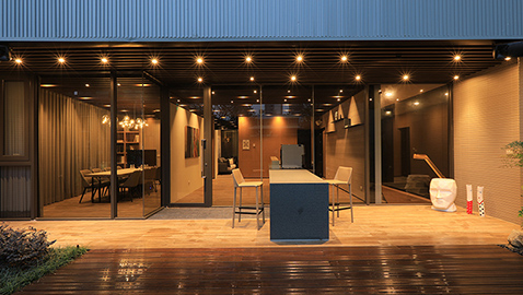
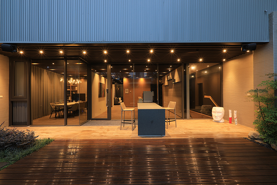
此案為友善都市景觀銷售中心,是為顛覆主流的銷售中心。以往銷售中心多以浮誇設計為主軸,且銷售期滿即會拆除,與當今友善環境的理念有所出入,為此,設計團隊結合客戶端友善環境及永續使用的想法,規劃此銷售中心,結合樹、景、宅之設計。
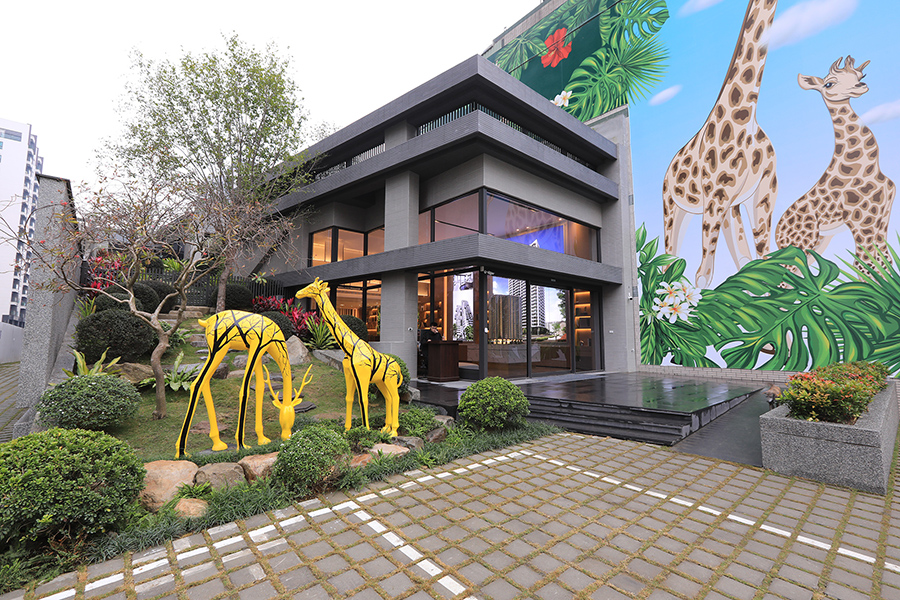
基地位於都市中心,兩面皆有建物,設計團隊以50%景、50%體為主要設計方向,呼應樹、景、宅之設計,將建築物結合大型斜坡綠園帶的方式,突顯長尖型建物之入口,刻意以地景藝術呈現綠坡道及建築物相互對化之關係。
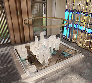
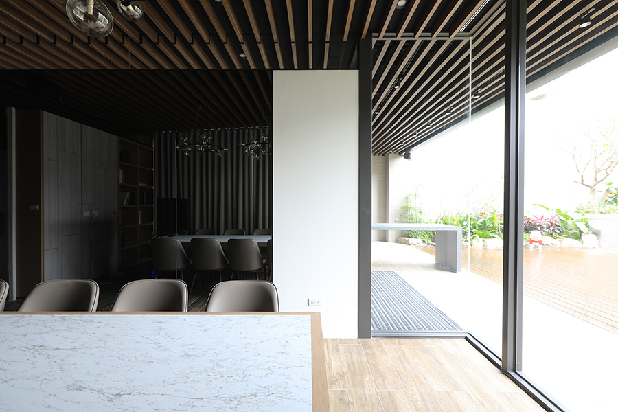
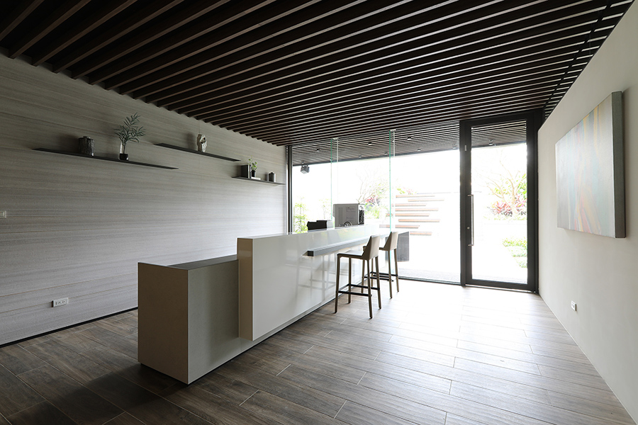
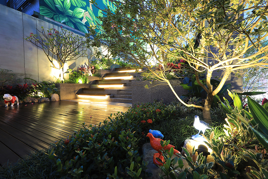
再者,為優化銷售的商業行為,入口處以分流的方式,一是以斜坡綠園道連結二樓戶外之展演空間,另一是銷售中心主要入口處,讓建物與斜坡環境融合,透過互動型的環境規劃,加上二樓之展演空間吸引人潮,符合當今潮流,讓人們於此得以拍照上傳,達到宣傳的額外效益。一樓入口處之大型建物模型、主要之接待櫃檯為等候接待區,控管人潮流量,建物側面運用採光結合外部斜坡地帶之視覺景觀,加強景深的空間效果。
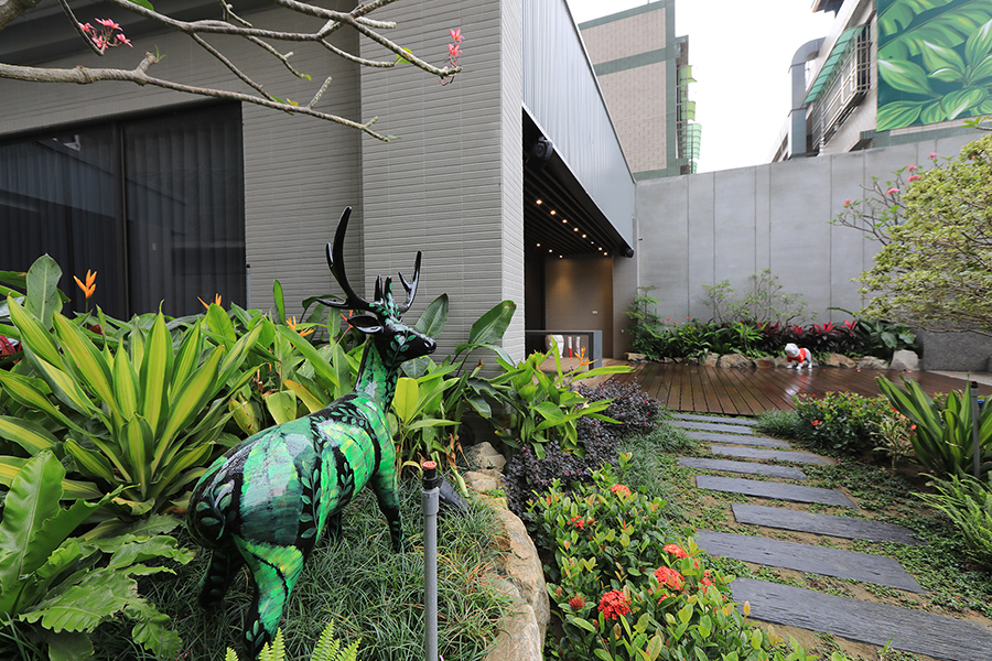
設計團隊將半永久性建物與設計之環境斜坡地勢結合,加強綠化環境之地勢相貌,運用地景藝術、綠化園道,以美化街道、提升人文氣息之永續使用。
Green rhythm of the city
This case is a friendly urban landscape sales center and a sales center that is subverting the mainstream. In the past, sales centers mostly focused on exaggerated design, and they would be demolished at the expiration of the sales period. This is different from the current concept of a friendly environment. For this reason, the design team combined the client-friendly environment and sustainable ideas to plan this sales center. Combine the design of tree, landscape and the building.
The site is located in the center of the city, and there are buildings on both sides. The design team takes 50% landscape and 50% volume as the main design direction, echoing the design of trees, landscapes and houses, combining the buildings with large slopes and green parks, highlighting the long-pointed shape, entrance of the building deliberately uses landscape art to present the relationship between the green ramp and the building.
Furthermore, in order to optimize the commercial behavior of sales, the entrance is divided into two ways. One is to connect the outdoor exhibition space on the second floor with a sloped green parkway, and the other is the main entrance of the sales center to integrate the building and the slope environment through an interactive type. The environmental planning, coupled with the exhibition space on the second floor, is in line with the current trend, allowing people to take photos and upload them here to achieve additional benefits for publicity. The large-scale building model at the entrance on the first floor and the main reception counter are the reception area to control the flow of visitors. The side of the building uses daylighting combined with the visual landscape of the external slope to enhance the spatial effect of depth of field.
The design team combined semi-permanent buildings with the designed environmental slope terrain, enhanced the landscape of the green environment, and used landscape art and green garden roads to beautify the streets and enhance the sustainability of this case.
國際獎項報名代辦洽詢專線:02-2799-7723

