描述
在意設計- 李穎宗
本案為解決建築結構本身的高低落差,利用曲線的方式弱化低梁的存在感,放大空間的視覺效果;以弧形作為間接照明中的延伸造型,顛覆一般氛圍照明的呈現效果;更直線延伸沙發上頭的間接照明,在一進家門時,將焦點一路延伸到餐廳的裝置藝術牆面,達到視覺引導的效果。
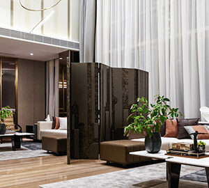
客廳以純白色作為背景,使「人」成為空間裡的焦點;利用造型企口板作為牆面的直向延伸,更加強了原有三米一的天花板高度,使用最大面積的門片進行規劃,濃縮分割的使用率,讓線條切割大大降低,提升空間的純粹感。局部的直向深色點綴,隱沒了建築梁線給予的低天花突兀感,再利用材質本身對光影變化的反射,讓底部的特殊材質具有凸顯且低調小巧思的驚豔效果。
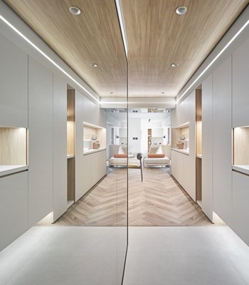
若隱若現的冰柱玻璃搭配黑色俐落的鐵件門框,讓內部保有一定隱私,也增加空間中的光線穿透,使整體空間更加簡潔、更加高挑;搭配帶有些微細紋的淺灰色沃克板,達到配色上灰質調的整體感,再利用深咖啡色的魚骨拼木地板,提升空間的溫暖度及活潑性;在主臥室往小書房的過道空間安排造型拱門燈,增加更多俐落性及科技感。
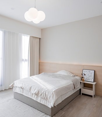
在長輩的房間中,設計師評估適合長輩視線的環境光源及色溫來進行安排,並配合著較為明亮的淺色貝殼杉作為主要面料,搭配白色的人造石材,更增添輕盈的環境效果,達到長輩輕鬆的空間享受;為了解決床頭上方遇上的建築梁線風水上的問題,我們利用了高天花的優勢,將收納空間集中到床頭後方的建築梁線下方,設計師規劃移動式床組,將不經常使用的生活用品收納在後方,即可解決長輩收納空間的需求。
在這裡,設計師將每個空間都以單一的配色統一視覺的和諧度,搭配線條的濃縮整合,達到純粹的空間體驗;每個形體上的考量都配合著光線原有的特性及型態,每個動線使用的規劃都配合著使用者的常態習性,讓空間更純粹的體現出各種應用的最高價值。
For this project, to solve the height difference of the building structure, the designer has brilliantly utilized a curve to soften the presence of low beams and amplify the space visually. Besides, the arc is used as the extension shape in indirect lighting to distinguish the visual effect of general indirect lighting design. The sofa is also extended in a straight line. What’s more, the indirect lighting on the top extends the focus to the installation art wall of the dining place in the house, achieving the effect of visual guidance.
The designer sets the living room in white, making the “occupants” the main focus of the space. The use of shaped match boards as the vertical extension of the wall further strengthens the original ceiling height of 3 meters and 1. In addition, the designer uses the most significant piece of doors for planning, condensing the utilization rate of segmentation and greatly reducing the line inconsistency in the space, and enhancing the purity of the area. The partial straight dark embellishment hides the discomfort that the low ceiling provided by the building beam line. Moreover, the designer then uses the material’s reflection to change the light and shadow. The unique material at the bottom produces a stunning highlighting effect and offers low-key ingenuity.
The looming icicle glass and the black and neat iron door frame keep the interior privacy. It also increases the light penetration in the space, making the overall area more concise and taller. The general sense of gray tones is used in the color arrangement, and the dark-brown-fishbone-patterned wooden floor is used to enhance the warmth and liveliness of the space. The aisle from the main bedroom to the small study is installed with a modeling arch lamp, which adds more neatness, flexibility, and a high-tech-ish vibe.
In the elder’s bedroom, the designer selects the ambient light source and sets the color temperature suitable to care for the elders’ eyes’ health, using the brighter light-colored kauri as the main fabric and white artificial stone to add a light environmental effect. It is a relaxed and enjoyable space. To solve the problem of “feng shui” of the building beam line encountered above the head of the bed, the designer takes advantage of the high ceiling to create the storage space under the building beam line behind the head of the bed. The designer arranges a mobile bed set for the client to store infrequently-used daily items in the back to satisfy the elders’ needs for extra storage space.
In the house, the designer unifies the visual harmony of each space with a single-color scheme and combines the concentration and integration of lines to achieve a pure space experience. The planning of each moving line follows the users’ everyday habits so that the space can more purely reflect the highest value of various applications.


國際獎項報名代辦洽詢專線:02-2799-7723


