描述
澤序設計- 張于廷
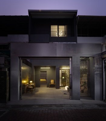
陪伴當地居民、饕客歷經近35年考驗的世傳魷魚羹,透過本次象徵性的外觀與室內設計,勾勒出與在地顧客多年的回憶,重新包裝、出發。以木作和石材交織對比,在街道上脫穎而出。深具現代簡潔風格的色澤與流線,搭配上人文與歷史意象的材質與設計手法。石材的沉穩和重量訴說著老店的經驗、重要性,而木質的溫潤和彈性象徵其好客的服務態度。不可缺一的元素與特性交織、互相支持著,襯托起整棟建築,穩固地持續陪伴在地居民的每一日。
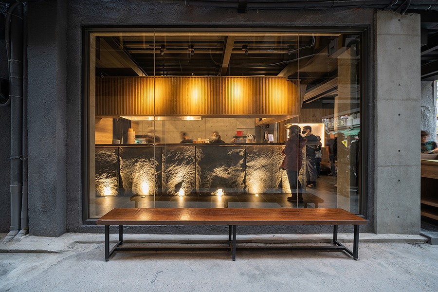
一樓店面處以大面積透明落地窗引進光線,搭配門口的植栽設計,讓整體空間更加明亮、整潔、通透。透過玻璃櫥窗,顧客能清楚看到前台點餐的流程與服務。聚光燈打亮於石面上,做足店面的隆重歡迎,也吸引客人的焦點目光。
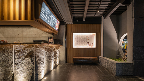
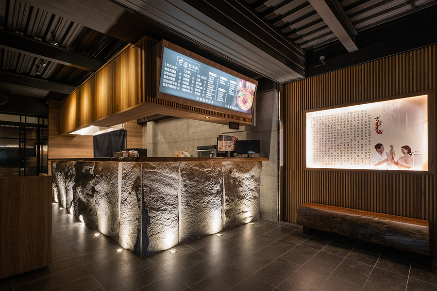
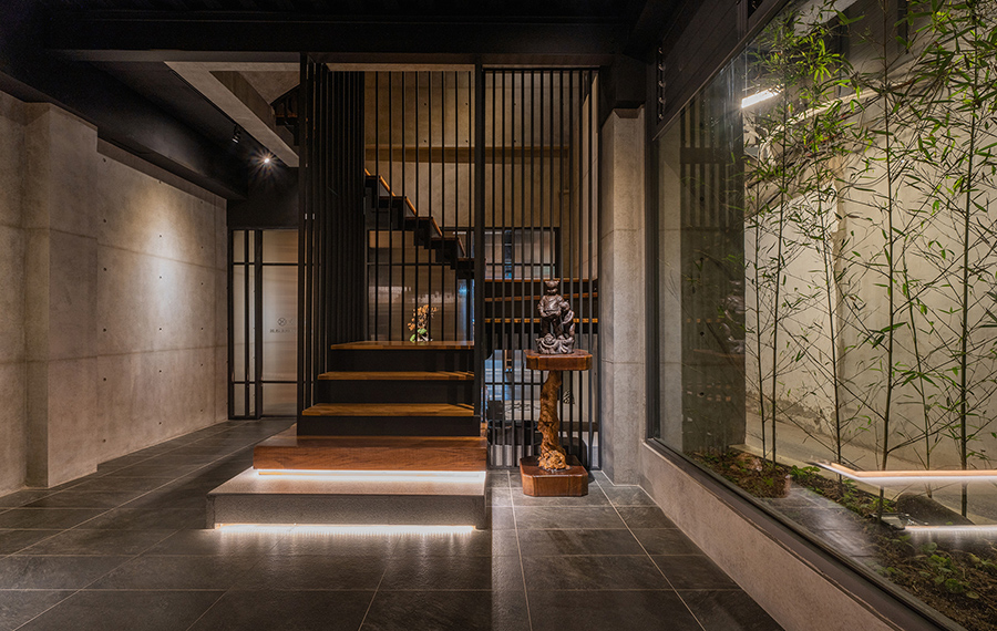
一入大門處,玄關以石材的重量穩坐、木條紋柱的輕盈通透搭建於上方,作為菜單展示與旁側的故事回顧,用墨黑的天地,鋪陳包覆起整體空間。穿過前台,以黑色金屬邊框的霧面玻璃拉門,分隔出櫃檯與用餐區,既保持隱密寧靜,更引進光亮。以黑色鍍鈦鐵件作為線條勾勒,框畫玄關處的樓梯,以及具現代感的窗稜隔間,增添流線、層次和穩固性。
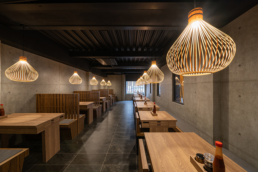
用餐區的材質設計,完美地與建築外觀呼應。以乾淨整齊的灰黑白色澤,石材、清水模等使用來撐起空間的方正、整齊與穩固。而大地色系的木質櫃檯、長型椅、吊燈,和空間尾端的牆板,透過燈光點綴,顯其舒適明亮。
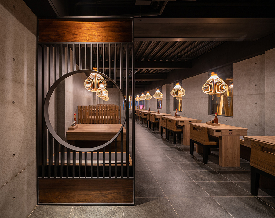
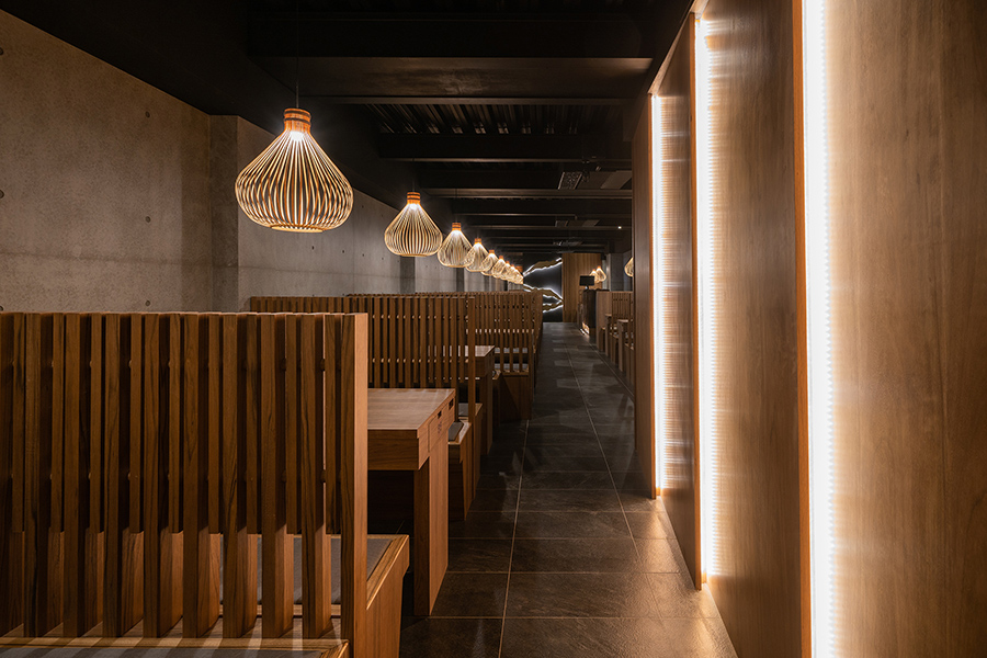
使用於長椅椅背的木條柱,讓光線與空間穿透。各自相連接的椅背隔柵,保有適當私人空間,亦可將坪效用到最大值,容納更多饕客、家庭,卻不顯擁擠凌亂。給予客人舒適的用餐環境,更增添光影穿梭來回的美感。
而空間尾端的木質牆板,也以層次堆疊和間接燈光點亮空間,奠定一清晰、簡潔,具變化的氛圍。配合仿燈籠型態的簍空吊燈設計,黑色牆板對比白色燈光筆觸,如同極簡的現代潑墨畫。以飽含人文氣息的工匠溫度妝點空間,用燈光、質料、色澤營造藝術美感和空間氛圍。
For almost 35 years already, the local restaurant selling squid potage soup has accompanied its customers through their lives. This time it has returned with its brand new look representing the history of its delicious local food and unforgettable memory with customers.
Walking on the street, the restaurant stands out from the rest of the shops with its new cloth in wooden bars interweaved contrasting with the steady stones. Symbolically, two main materials used here for exterior design represent the long history of its food, service, and memory. Both materials take time to form. The heaviness of the stone stands for the importance, whereas the wood stands for flexibility and hospitality, interweaving into a great long history holding up the restaurant.
On the outside, the first floor is framed within glass wall panels with some greenery outside to refresh the heaviness of stone. The glass wall panels on the other hand, offer a great sense of transparency, tidiness and brightness. By using the spotlight on the sides to light up the counter, it emphasizes the business and draws attention from the outside. For the others looking in, they can easily see the process and the service.
Once entering, customers firstly see the counter with the menu on the top clearly shown. While waiting for its order, the right side of the wooden panels carries up a piece of information for one to know more about the restaurant’s history. Passing by, entering the place, one can see the sliding glass doors offering a sense of privacy while keeping the light shine through. The metal bars serve as decoration and staircase railing, providing a sense of firmness.
As for the dining area, the interior design here beautifully echoes the facade. With its similar use of materials and color palette: Earthy colors as the furniture to welcome and take in the guests, whereas the clean achromatic colors and the stones hold up the space.
The wooden bars on the backrest of the long chair contribute to the transparency and permeability of the space. It makes customers feel less crowded in between, yet can be considered as partition. A great customer experience always comes with a nice comfy environment and its surroundings. Simultaneously, while the lighting shines on it, it creates shadow as one of the decorations of the space.
As for the floor, ceiling and walls, with the combination of achromatic colors, stone materials, and architectural concrete, it holds up the space, mimicking the sky and earth. The colors keep the space clean and neat. Yet, the texture of the material offers steadiness.
On the other side, the lighting delicately brightens up the space and sets the tone as comfy yet simple; modern but artisanal. While the wooden chairs and desks are the protagonists in the area, the bamboo ceiling lamps light up the space, corresponding to the wooden texture and the bamboo plantation outside of the restaurants. Indirect lighting design is used here both behind the wood panels on the sidewall and the symbolic sign on the black board. This strategy builds up artistic beauty and the atmosphere, at the same time, offers enough lighting to the space.
國際獎項報名代辦洽詢專線:02-2799-7723

