描述
大塊設計- 施佑霖
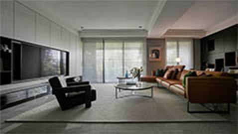
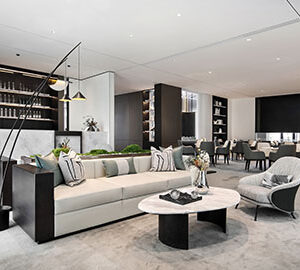
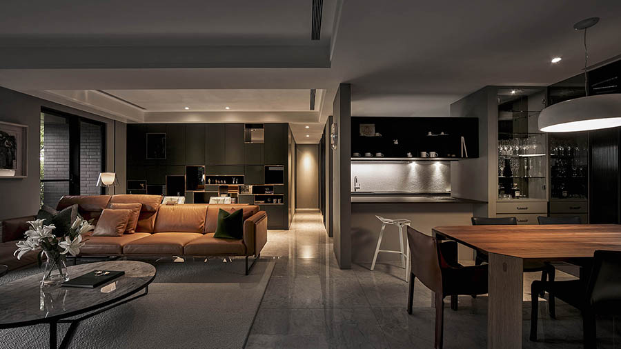
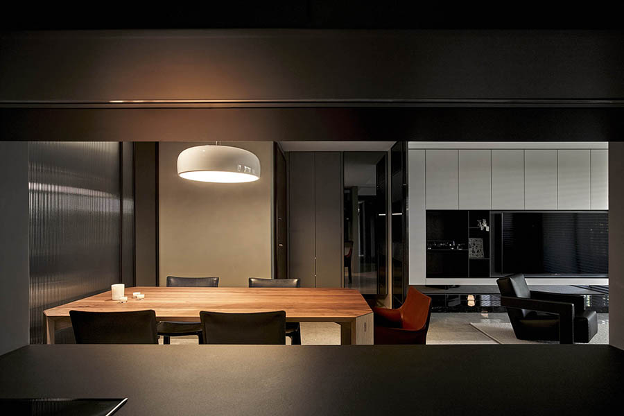
本案住宅經由客變程序,以半毛胚狀態逐步建構,設計師依照使用者所需條件,架構整體空間藍圖。以生活機能為動線思考,將開放的公共空間分為:客廳、書房及餐廳三大主要場域,讓機能兼具的情況下,提供居所不一樣的細節變化。
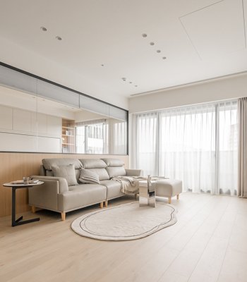
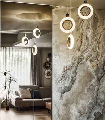
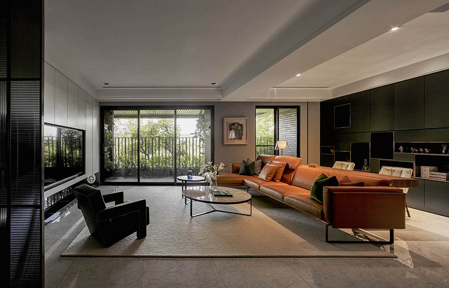
條紋玻璃和鍍鈦金屬鑲邊的屏風,豎立於玄關入口,隱約的透視感,讓光線自由流動,減少空間壓迫。入門後印入眼簾的公共區域,寬敞開放,以拋光白色仿石紋磁磚鋪陳為底,深綠色書櫃以及燃橙色皮沙發為亮點,豐富中帶點沉穩的個性。無高樓遮蔽的住所,透過露臺的寬敞、大面積的落地窗,引進外在的風光明媚及樹梢綠蔭,陽光灑落、穿透露臺植栽綠葉,光影之間的跳躍,變化多端、舒適宜人,猶如一幅動態畫,恣意瀟灑。良好的採光,營造室內各場域氛圍,一股清新、趣味的氣息油然而生。
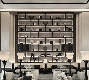
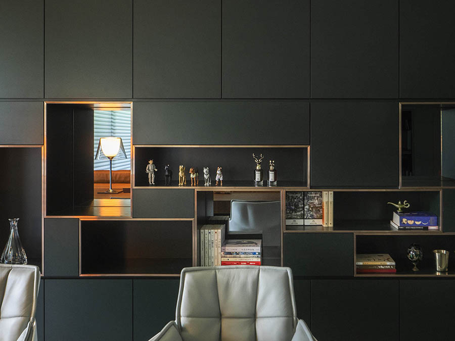
因業主喜好綠色,設計師將各綠色單元鑲嵌其中,書房收納櫃成為公共空間的視覺主體, 以深綠色烤漆搭配不規則金屬邊框的立面分割呈現,開洞處櫃底以灰鏡鋪陳,在反射和光線的變化下,帶出不同層次和角度的視覺變化。素面牆以灰綠色油漆呼應深綠主調,廚房場域則以黑白和木質深色框起,不須特別分隔場域,以材質和色調巧妙的將開放空間劃分,創造寬敞明亮的公共空間。
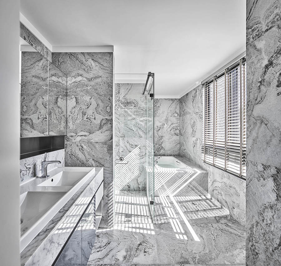
客用廁所因原有條件較瑣碎,因此設計為公私領域共用處,讓兩側開口形成循環動線。地板選擇布紋質感花紋,配上不規則分割的磁磚,打破原有框架,利用條紋玻璃的凹凸折射增加通透感、保持私密感。
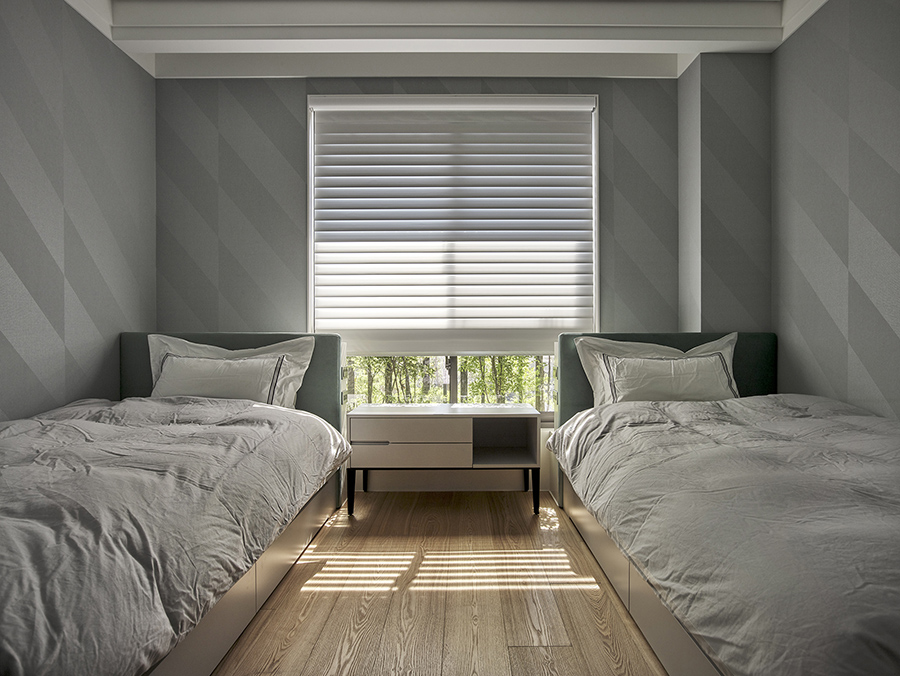
以一致的設計語彙界定空間,規劃主臥室及未來的小孩臥室,以木地板及其他材質選配塑造私人個性。大面積元素、空間色彩統一,與燈光設計相互搭配,多處開窗引進戶外景色,成為最完美的自然妝點。營造舒適睡眠的質感,運用軟件及家具搭配,不須刻意強調空間風格,讓業主的生活物件融入整體空間,在自然愜意之中,成功提升居家氛圍。
The case was initially structured yet unfinished with its interior design. Besides the original arrangement of materials and standard choices of furniture, the designer is able to build up the rest of the space into a comfortable residency based on users’ needs.
For the lighting design, the surrounding of the case’s location doesn’t have a lot of tall buildings to block the natural sunlight shining in. Thus, the balcony introduces excellent lighting with greenery planted outside. A great natural lighting contributes to the main lighting design of the space, giving a comfortable and refreshing atmosphere, broadening the spatial perception.
The flow of the space is designed based on the habits of the users. The public area is divided into three major sections: Living room, the study and the dining room. Under this arrangement, without downgrading the functions of each area, the design can provide what the residents need just with slightly different changes within the details.
Since the owner’s favorite color is green, the designer decides to blend the color in different places. The book shelves behind the sofa take on the primary visual theme of the public area. With a greyish mirror used at the back of the shelving, dark green baking and irregular metal trimming on the surface, it produces different layers of reflection and changes of lighting. In general, the walls are painted plain light moss green, corresponding to the green tone of the space. As for the kitchen, the dark colors are chosen to be the main tone, combining with white circular mosaics, juxtaposing with the other spaces.
The designer uses an identical design language and different details to define each space. Same strategy is used in private spaces. With wooden floors and other different materials combined, big-sized of the same elements used here make the color of the space much more corresponding. With a great use of lighting design and the outside scenery as the best natural decoration, it builds up the atmosphere of comfortness without needing to emphasize the style of the space.
國際獎項報名代辦洽詢專線:02-2799-7723

