描述
形拾室研- 曹登勝
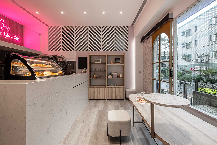
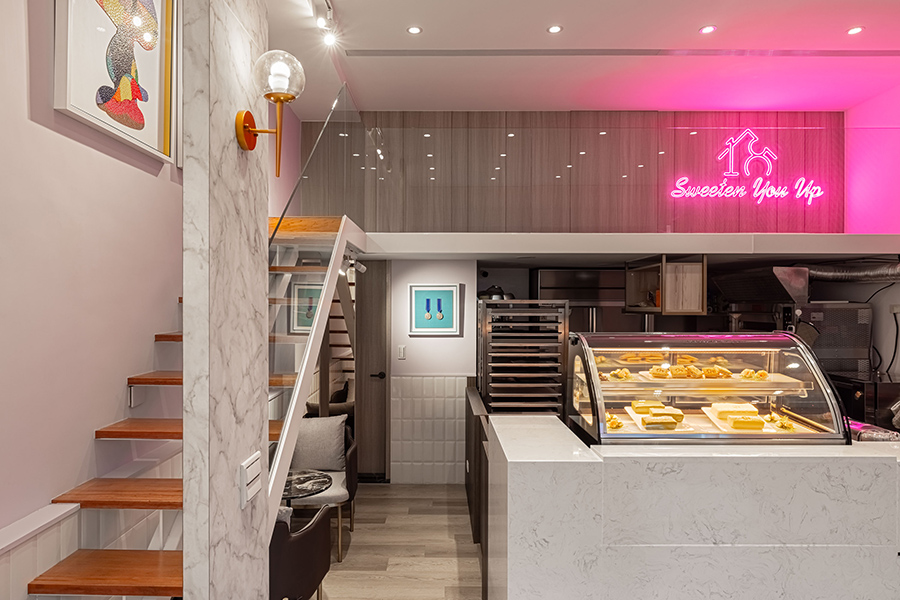
開一家屬於自己的甜品店,不單單關乎於製作甜點,對於其他的管理也需要付出較多的精力。門面的裝修風格,正好體現了一家甜點店的整體主題。設計師因此使用粗獷又豪邁的石頭漆於店面,黑石英磁磚與左側微微蜿蜒的白面牆做出清晰對比。室內以北歐風格的木質地板、淡灰白的基調為底色,牆面右上方的粉色霓虹燈,點亮了整體空間。
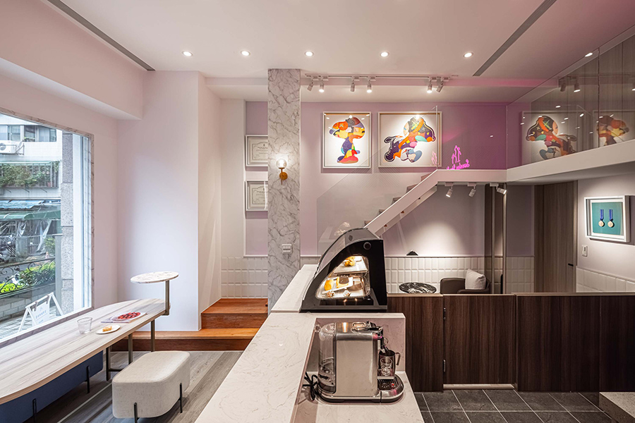
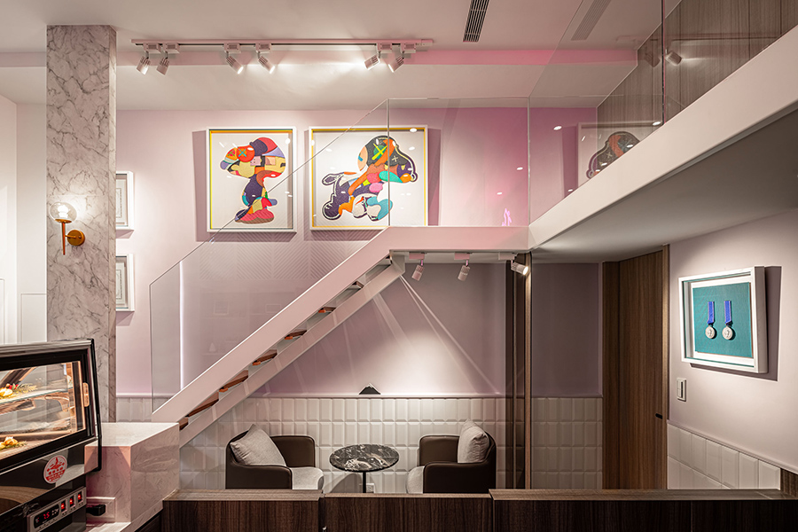
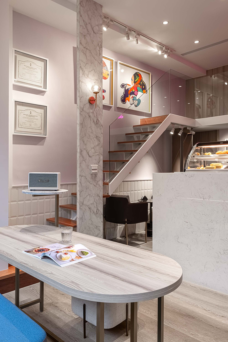
銀狐大理石紋、金屬色的裝飾、時尚灰等經典搭配,使得相較狹窄的空間不顯擁擠。門口的大片落地窗引入陽光街景,映在淺色木質、白皙肌理的空間中。開放式的櫃體、斜體簍空的格柵窗、漂浮的樓梯以及透明的玻璃片,開闊通透了整體氛圍。
以自然視角設計櫃檯高度,微微傾斜的甜點展示櫃讓顧客可以輕易一覽、挑選甜品。窗前的座位區則讓人在欣賞風景之餘,可以細細品嚐甜點的滋味。樓梯下方的角落提供一隅隱私空間,以後方的鏡面延伸空間感。牆面上的兩幅畫,在相較明亮白淨的空間中,點綴一絲色彩。粉色霓虹燈透過玻璃與光線的反射下,層層交疊,創造不同角度的呼應,甜而不膩的氛圍色調,為壹拾捌甜點室打出最適切的品牌形象。
It is not only about making desserts when it comes to opening a pastry shop. A facade’s design can be the first visual image that represents the brand. With bulky and bold features of the white stone coating on the facade, the designer contrasts it with the black quartz ceramics and the slightly curved walls. Inside the shop, the Scandinavian wooden flooring and the white-grey tone are the foundation, while the pink neon sign on the right corner brightens up the whole space.
A classic combination of white marbling veins, metallic decoration items, and fashion grey elevates the spatial perception in a relatively narrow space here. A great-sized floor-to-ceiling window at the entrance introduces sunlight and streetscape, reflecting on the light-colored wooden materials and the pure whiteness of the space. The use of open shelving, tilted lattice, wall-mounted stairs, and transparent glass panels open up the whole space with a better fluidity.
The counter is designed to be slightly higher, where the fridge for dessert display is closer to one’s natural angle and perspective. The slightly tilted display allows customers to easily view and quickly choose the pastry.
Afterwards, one can sit in front of the window to enjoy the streetscape while enjoying the dessert. The small corner under the staircases provide a little privacy with the mirror at the back to expand the spatial perception.
Two paintings used on the wall add in some colors to the luminous whiteness in the space. Through glass and reflective materials, the pink neon lights reflect several times, eventually creating interesting overlapping. From different perspectives, they all echo each other to create a sweet yet not too intense atmosphere, offering the most adequate visual identity for the 18 Dix-Huit Patisserie.
國際獎項報名代辦洽詢專線:02-2799-7723


