描述
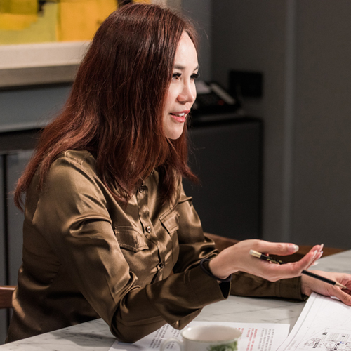
大塊設計- 施佑霖
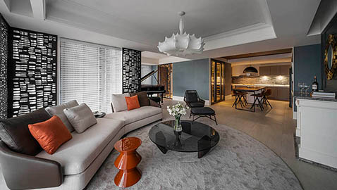
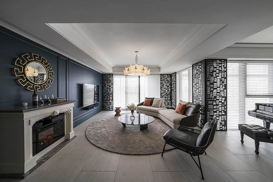
白金色的光芒穿透,灑落於溫潤整潔的質料上,光影的靈巧在磁與木之間,翩翩起舞。琴上音符輕巧跳躍,黑白之間和諧共存、靈活玩耍;琴鍵與室內設計的相輔相成,藝術之美得以跨界融合。溫和的大地色系包覆著空間的輕重、白的純淨點亮了空間,無限延伸;尼羅藍的豐富厚饒,冷靜的將空間劃開、深刻了空間的個性:單純色系的饗宴帶給居住者,自由奔放的美感,聰慧卻不踰矩。
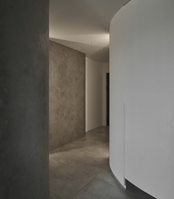
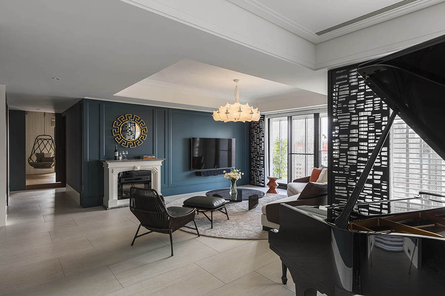
本案設計營造了思緒停留伸展的空間,讓色塊、材質劃分場域界線,讓光影、質感、線條去延伸、容納。一步入空間,玄關處的尼羅藍隔間與黑色簍空隔屏,預告了空間的主題;有深度的美不失細細品味的樂趣。踩在細膩繁盛的藍白花磚上,玄關是居住者出門奮戰現實的預備、也是入門享受內在隱私與想像的起點。
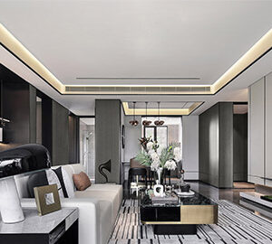
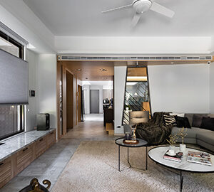
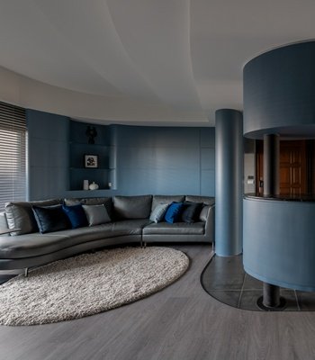
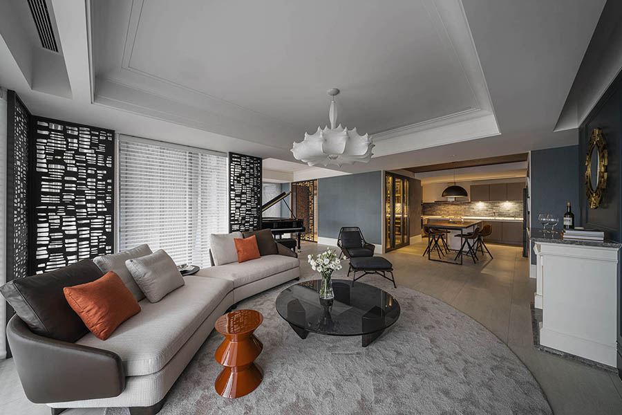
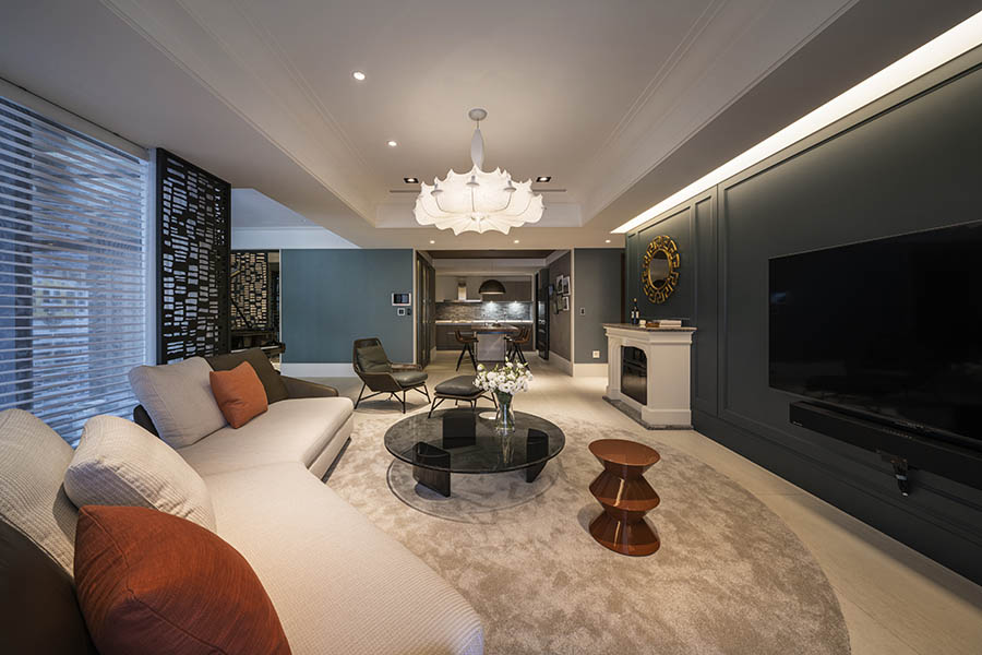
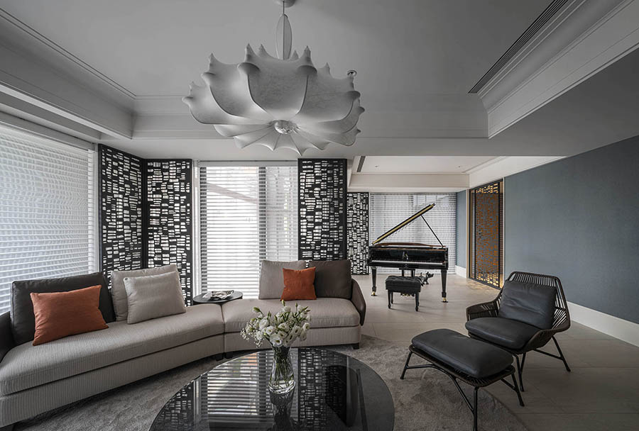
拉門入內,尼羅藍的冷靜與重量將私領域劃分;極黑純白的對比,整潔出客廳的公共空間。黑色簍空隔屏在轉角處,柔和了銳利、增添了光影的把玩。大地色系的土木橘和布料的軟婉,舒適了空間氛圍、包裹了疲憊。黑白鍵的琴聲與室內的黑白塊狀線條相呼應,跨界融合美的不同可能性。
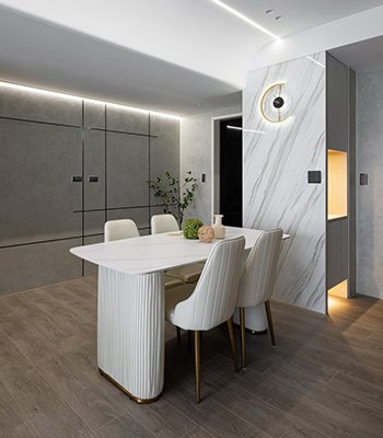
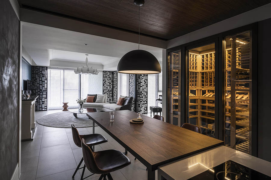
轉身處的深灰與沉穩木質,框出了廚房的空間。深灰的牆面讓廚房處條理不紊亂。木質的親膚舒適、堅韌柔軟適當的承接了「飲、食」的感官饗宴。私人酒窖的儲存、天花板與桌椅的木質、暖色燈光的照護,將生活最大的享受之一穩重容納。
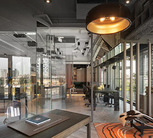
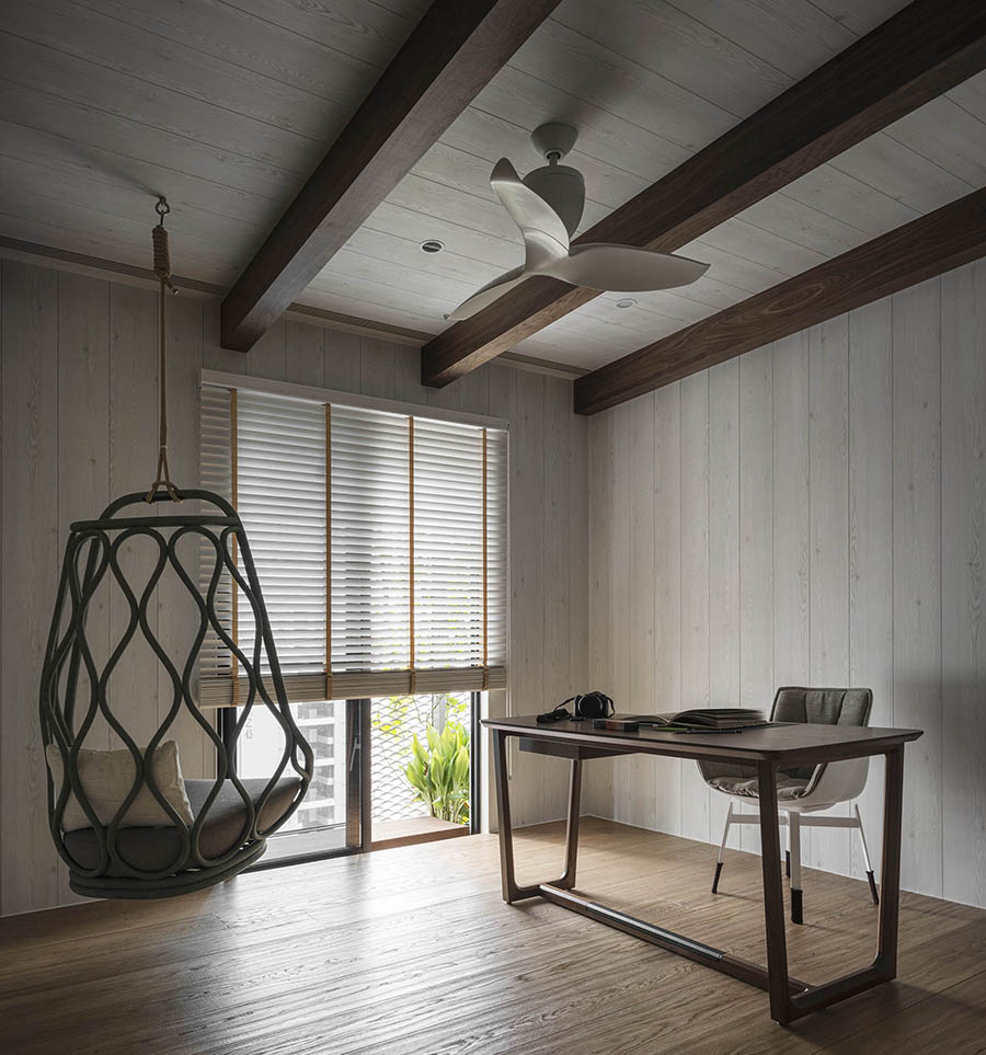
感性與享受之餘,也不忘讓思緒釐清延伸,書房處的木以深色調與米白色為基礎,物件線條簡潔、木質紋路隱隱流動,讓細節與輪廓成為空曠處的最佳裝飾。顏色的深亮度平衡,讓意識穩行。空曠廣大的感受,給予思緒解放的空間,藉以延伸喘息。落地窗的陽光灑落於桌於地,也落進了思緒者的世界中。
如此具有輕輕禪意、冷靜簡潔的空間,卻可同時容納生活享樂的精隨。讓純淨的色彩與材質去劃分、去帶出各空間該有的性質,營造各區間該有的功能、氛圍。毫無多餘的設計,以使用者的經驗為最大考量、美感兼具。留白處得以將空間留給主人,創造更多生活的可能性。
Silvery and golden beams of light glistens on the neat tiles and soft wooden floor. As the show goes on with musical notes jumping around the space, the black and the white intertwist, coexist. The piano keys echo with the interior design, different aesthetics go beyond boundaries, hence merging into one. Gentle colors of earth tone carry the weight, whereas the purity of white brights up the space, going beyond. Nile blue’s abundance, distinctively partitions the space, yet sets up the characteristic. The simplicity of colors brings out the beauty of boldness yet not turning into aggressiveness.
The design of this case builds up a place to stretch one’s mind, to linger over thoughts. Blocks of colors and materials draw lines between areas; while lighting, texture, shapes and lines allow the space to extend and accommodate.
Once entering the space, the nile blue wall and black hollowing-out partition announce the main theme of the space: a profound beauty that is worth appreciating with care. The Portuguese tiles unfold at the entrance. The sophisticated beauty symbolizes a start for everyday life, to prepare yourself in reality and to open up a space of privacy and imagination.
Pushing aside the door, all of sudden, the clarity and richness of the nile blue draw a line on the private space. Contrasting pure black and white immediately tidy up the public area of the living room. Black hollowing-out partitions sit at the corners to soften the sharpness, playing with light and shadow. The softness of lining and warm colors tone down the atmosphere, releasing the fatigue. The black and white of piano keys correspond to the design, showing the possibility of different types of beauty and art combined.
While turning to the left side, shades of grey and firmness of wood frame the kitchen space. Grey walls offer a sense of organization and tidiness. Wooden texture offers a firm yet soft feeling that could carry the feast for senses. The use of wood on a private wine cellar, ceiling, desk, and chairs, covered with warm lighting, holds up the most important joy of life.
A space with such a calmness and tidiness, can also offer the essence of joy in life; Allowing the purity of colors and materials to draw lines, to bring about the features of the space, to build up the function and atmosphere of each area. A design without redundancy takes care of the user’s need and experience, as well building up the aesthetic of the space. Leaving the blank space to the owner, one can go on to create different possibilities for life.
國際獎項報名代辦洽詢專線:02-2799-7723

